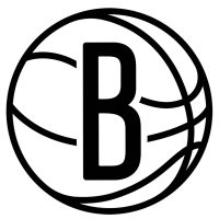

According to the Brooklyn Nets’ official style guide, the franchise is making several changes to its logo set for the 2024-25 season.
The Nets have promoted their partial logo – which features a “B” inside of a basketball – to primary status. They have also made the lines on the ball thicker, as they previously tapered off around the curvature of the ball.
This logo replaces a shield that included the ball below a “Nets” wordmark, which has been their primary mark since they moved to Brooklyn in 2012-13, but is now relegated to special applications only.
The shield was also used as the Nets’ global logo, though it also featured a Brooklyn wordmark below it to comply with the league’s international guidelines. It is no longer part of the franchise’s logo set.
Instead, the Nets have promoted their secondary logo – which is the aforementioned ball with “Brooklyn” and “New York” wordmarks inside of a thick black circle – to global status.
The updated version drops “New York” for “Nets,” however, and adjusts the spacing and size of the wordmarks, presumably to account for how much smaller the nickname is than the city/state.
Lastly, Brooklyn has introduced a new secondary logo, which is a stylized “Nets” hanging from a rim. It’ll be the first time a net is depicted in their logo, though they previously had a rim during their time in New Jersey (1997-2012).
This logo replaces a “*BKLYN*” wordmark that was used on the Nets’ 2019-22 Statement Edition uniforms, which confirms they’ll unveil a new Statement set before the start of the season.