JamesBrey/E+ via Getty Images
In a Seeking Alpha article six months ago, we forecast an August top for this market. It was based on the average lifetime of recent bull markets. We are now a little less than two months away, and our sentiment indicators have grown to strongly support this forecast. If correct, it would mark the end of the two-year bull market and the beginning of a significant correction. It would also prompt the question: what type of market correction will it be?
Before we get into that, we’re first going to review the nine indicators that make up our Master Sentiment Indicator (MSI) and where the MSI stands today.
Why Investor Sentiment Is So Important
When determining bull or bear markets, what investors think and expect is more important than forecasts of interest rates or the economy. That’s because it’s not economic data that drives markets, but how investors react to it. If “too many” investors are bullish or bearish, there are too few buyers or sellers left to drive prices up or down, no matter what the economic outlook.
So, at the Sentiment King, we measure investor sentiment looking for moments when there are “too many” bulls, or “too many” bears. These moments of extremes in investor expectations have historically occurred near tops and bottoms of the market.
The Master Sentiment Indicator
Below is a list of the nine indicators that make up the MSI. Each has a long history of success as a sentiment indicator in its own right:
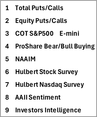

The Nine MSI Indicators (The Sentiment King)
We put each one of these nine indicators on the same Sentiment King ranking scale, so they can be compared one to the other. The table below does this. Each of these nine indicators is found in the top row of the table:
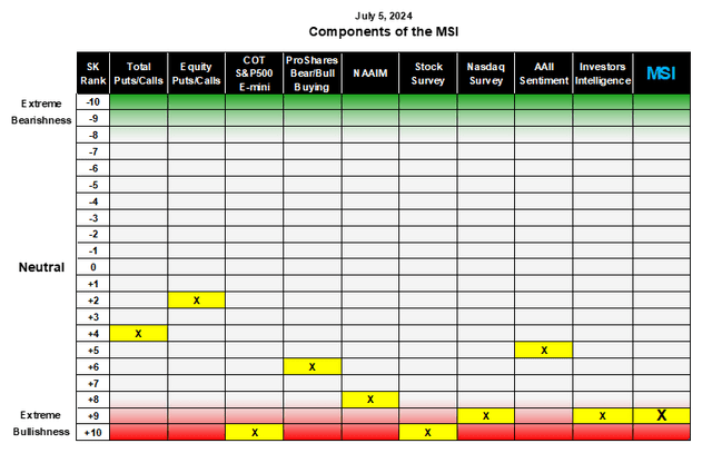

The Ranking of Each of the Nine Indicators on the Sentiment King Ranking Scale (The Sentiment King)
On the far left column of the table is the SK ranking scale, which goes from -10 at the top to +10 at the bottom. Readings from +8 to + 10, called Red Zone readings, show extreme bullish sentiment. A Red Zone reading means we have “too many” bulls.
Readings from -8 to -10, called Green Zone readings, show extreme bearish sentiment. They show when there are “too many” bears. The yellowed cells with an X show where each indicator is located on the scale. What’s extreme for each indicator is determined from historical records that go back many years.
The far-right column is the Master Sentiment Indicator, which is the composite made from the nine indicators. To form the MSI, each of the nine indicators is given a weighting in proportion to the square of its current ranking. This gives an indicator with extreme readings slightly more importance in the composite than those with neutral zone readings.
Four of the indicators, plus the MSI itself, are now located in the Red Zone. Let’s first look at the four indicators – then show the history of the MSI and where it sits today.
The COT S&P 500 E-mini
We take the weekly commitments of traders (COT) data in the S&P 500 futures and calculate the percent that money managers are short the S&P 500. We average the numbers over three weeks to take out any anomalies. Right now, money managers have the lowest short position in the S&P 500 since before the financial crisis of 2008. This is extreme, and historically the reading is plus 10 on the Sentiment King ranking scale.
The Hulbert Stock Market Survey
Mark Hulbert has been monitoring the bullish and bearish opinions of newsletter writers on the market since before 2000. According to Hulbert, newsletter writers are more bullish now than any other time in the last 25 years. This indicator is also plus 10 on our scale.
The Hulbert NASDAQ Market Survey
Mark also keeps track of the bullish and bearish opinions of those writers who focus only on the speculative NASDAQ stocks. Only 5% of the time were NASDAQ newsletter writers more bullish than they are today. They have a ranking of 8.84 on our scale.
The Investor Intelligence Survey
The Investors Intelligence survey of newsletter writers has a history back to 1964 and is considered the granddaddy of all sentiment indicators. Right now 60% of their newsletter writers are bullish and only 16% are bearish. This is one of the most extreme bullish readings in its sixty-year history and has a ranking of +9.0 on our scale.
The Long-Term Picture of the MSI
This chart graphs the MSI on the SK ranking scale plotted against the S&P 500. The current reading of the MSI is 9.2, which puts it strongly into the Red zone.
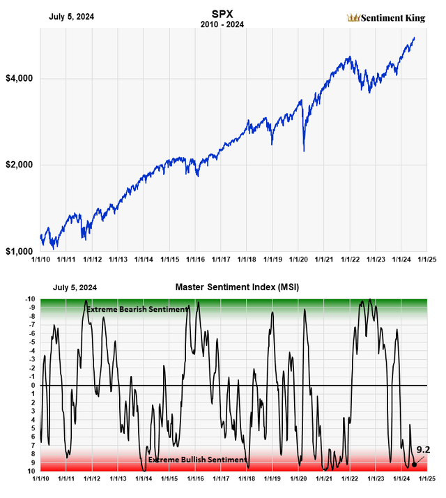

The MSI (Master Sentiment Indicator) is composed of nine classic sentiment indicators fused together using our SK ranking system. The following are the nine indicators that make up the MSI: The CBOE Total Puts and Calls Ratio, The CBOE Equity Puts to Calls Ratio, The CME Commitment of Traders data on the S&P futures, Buying in the ProShares S&P 500 Inverse Fund (SH), NAAIM Exposure Index (National Association of Active Managers), Hulbert Rating Service (Stocks), Hulbert Rating Service (Nasdaq), The AAII Sentiment Survey, and the Investors Intelligence Survey. The red-green chart above graphs the MSI over the last 15 years. Its ability to indicate major market lows is phenomenal and we believe it’s better than any economic or financial metric in this regard. (The Sentiment King)
This MSI chart highlights several things.
First, it shows why measurements of investor expectations are better than economic or financial metrics when forecasting the beginning and ending of bull and bear markets. As far as we know, no one has ever been able to find an economic metric that correlates better with bull market tops or bottoms than investor sentiment.
Second, it shows that investor sentiment is better at locating bear market lows than the tops of bull markets. There are numerous reasons for this, which we’ve discussed in other SA articles.
This is why using investor sentiment alone when looking for the end of a bull market, or the beginning of a significant correction, is very difficult; one usually needs to incorporate other factors to assist in the effort. We spoke of this in that January article when we forecast a top in August.
That said, we believe the confluence of these two factors – the extremely high levels of bullish sentiment as we approach the normal time span of a bull market – strongly supports the idea that this autumn will see a top in the market and the beginning of a significant correction.
The Transition Into An Autumn Market Correction
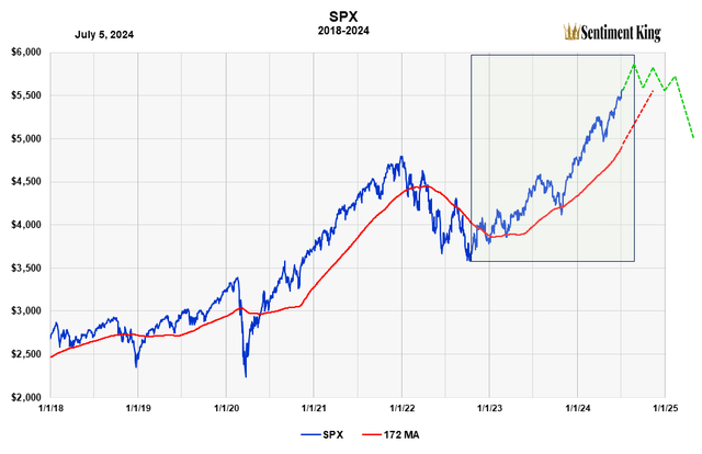
The normal transition from bull market into a significant correction is through what I call the “topping process.” Unless it’s interrupted or accelerated by an unexpected economic event or crisis, the topping process usually takes three to six months. It would look something like this:

A Schematic of a Normal Market Top and Correction Following a Two Year Bull Market (The Sentiment King)
The green rectangle shows the time forecast we established last January, with the right side of the rectangle being August. We’ve diagrammed in green the topping process into a correction.
We also show the 172-day offset moving average in red. It’s the moving average that did the best since 2000. The current price is so far above the moving average that’s a topping process will give it time to come up (red dotted line) to finally be penetrated as a correction unfolds.
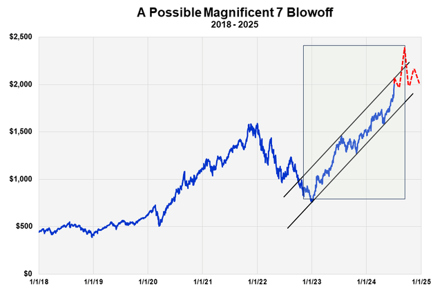
We’ve written about a normal market transition into a correction like this for the last three or four months. However, just recently another possible transition has emerged – a market top associated with a climactic price blow-off in the Magnificent 7.
A Price Blow-off in the Magnificent 7

A Schematic of a Possible Blow-off in the Magnificent 7 Marking the End of the Two Year Bull Market (The Sentiment King)
Price blow-offs don’t usually occur in broad indexes but in individual stocks, commodities, or a small sector of stocks like the Magnificent 7.
As we mentioned in this June article, seven large technology stocks have been leading this bull market and account for over 50% of all option volume, and close to 20% of all stock volume. They’re called the Magnificent 7 and their composite price is shown in this chart.
Notice that the advance, while dramatic, has been contained within the two parallel trend channels. A price blow off would be a movement above the upper channel into new territory. It’s diagrammed in red.
A price blow off is the opposite of a selling climax. It occurs at the end of a move, and it’s driven by buyer panic – investors piling in fearing that prices will never be lower again. The primary mistake is giving the price rising an economic justification.
Prices surge upward at an abnormal rate, then just as quickly reverse, retracing downward the upward movement. A blow-off, like a selling climax, is a rather conclusive signal that the market is ending its main movement.
While we still expect the market to move into the normal topping process as we enter Autumn, if we see the Magnificent 7 break above this trend line, this will be added confirmation to us that our basic forecast is correct but that this bull market is ending in a mini blow-off and not through a normal topping process.


