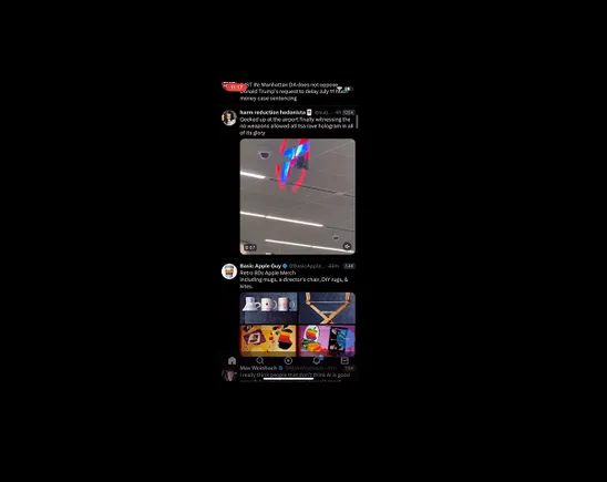
Elon Musk has always preferred minimalist design, with as many buttons and controls hidden as possible, leaving a more sleek and simplistic appearance.
That’s the approach that he’s taken at his other companies, so it should come as no surprise to see that Musk is also looking to implement a more stripped-back design ethos at X as well.
We’ve already seen this with the changes to link previews in the app, while over the last few months, we’ve also seen various examples of X’s more significant pending redesign, which will remove all the function buttons and metrics from the bottom of X posts in-stream, in order to put more focus on the content itself.
That’ll also change how you interact in the app.
In order to engage with posts, X will soon switch to a more haptic-focused approach, in that users will need to swipe left to like and post in-stream, and right to reply.
Which, again, clearly aligns with Elon’s minimalist vision, but it will be a significant change in how people interact in the app. And with most users never engaging with posts already, it seems like a risky move.
But that’s not the only UI shift coming to X.
X is also experimenting with more minimalist reformats, including a simplified “tap to expand” function, to more easily read longer posts.
While it’s also developing new video controls, based on more intuitive engagement behaviors.
These are interesting additions, which align with making the X platform more of an extension of natural movement and interaction, as opposed to pressing manual buttons on screen.
But will users come along for the ride, and follow along with these less upfront control options?
It’s worth noting here that Twitter had long grappled with how to simplify the app, with company execs viewing this as a key impediment to its growth.
Back in 2018, then Twitter CEO Jack Dorsey noted that using Twitter was “a lot of work”, with many new users having a poor experience the first time that they use the app, leading to higher churn rates. Twitter had sought to improve this, through improved recommendations and streamlined account set-up processes, but they could never seemingly get it right, and maximize its appeal among web users.
With this in mind, it’s hard to see how X’s coming revamp will help. Sure, having fewer controls on screen will mean less visual clutter, but it will also make it much more difficult for new users to understand how to interact with the app.
Maybe, eventually, this will better align with people’s expectations. But right now, it seems like a risky move, especially for a platform that’s seen little to no user growth in almost two years.
But Elon has a vision, and it seems that nothing is going to stand in his way of making it a reality.
And at the same time, past Twitter management was also too risk averse in this respect, rarely rolling out any change that hadn’t been beta tested for literal years beforehand.
It seems the optimal approach is probably somewhere in between the two, but maybe, Elon’s accelerated development program is just what the app needs.


