
The American Hockey League’s Bridgeport Islanders have brought back one of their parent club’s most famous (infamous?) logos and made it their new primary logo, starting in the 2024-25 season.
The Islanders introduced the new logo in their 2024-25 schedule video, which they posted to their social media accounts on Thursday, July 11.
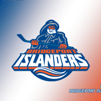
The new logo features the fisherman — complete with orange face and hands, white beard and blue rain slicker and hat with grey highlights — gripping a blue hockey stick above the words “BRIDGEPORT” in orange and “ISLANDERS” in white with an orange drop shadow. Below “ISLANDERS” is a portion of a circle with white and orange waves inside.
Bridgeport’s new version removes the teal that was included in the New York Islanders’ original fisherman logo, which was introduced in 1995 — save for a highlight on the stick, which may have simply been an oversight. It also gets rid of the hockey net behind the fisherman. But the “ISLANDERS” script in Bridgeport’s version bears a closer resemblance to the crest used on the NHL team’s Reverse Retro 2.0 jersey in 2022-23.

According to NHL.com, the original Islanders fisherman logo was part of a rebrand meant to help the team keep pace in the New York sports marketplace. “There was this thinking that fans were starting to associate the original Islanders logo with the failure of the past two seasons rather than the dynasty greatness,” said Nick Hirshon, author of We Want Fish Sticks: The Bizarre and Infamous Rebranding of the New York Islanders. “Maybe some idea of getting a new product out there that would get you some money on the market, get some new jersey sales going and maybe that money could be funneled into improving the team and the arena.
Sports marketing and design firm SME headed up the project to create a new logo that would “better personify what it meant to be from Long Island.” They eventually landed on the fisherman. But it proved unpopular, and with its resemblance to the mascot for Gorton’s Seafood, chants of “We want fish sticks!” soon rained down on the Islanders from opposing fans. Coupled with poor performance on the ice, the Islanders retired the fisherman and reverted back to their old logo by the 1997-98 season.
Bridgeport’s new fisherman logo replaces the primary logo the team had used since changing its name to the Islanders for the 2021-22 season. That logo featured a hockey stick making up part of a B, with a roundel in the background and “ISLANDERS” spelled out in white.

The team was known as the Bridgeport Sound Tigers from the time they joined the AHL as an expansion team in 2001 until 2021. They have been affiliated with the NHL’s New York Islanders for their entire history, and the NHL Islanders purchased the club from its original owners in 2004.
Along with the new logo, the Islanders debuted a new wordmark. It emphasizes Bridgeport with a larger font and a B with added embellishments. “ISLANDERS” is spelled out below in a smaller font.
The Bridgeport Islanders open their 2024-25 AHL regular season on Saturday, October 12, when they host the Providence Bruins.