Klaus Vedfelt
This article aims to examine the US sectoral flows for July 2024 and assess the likely impact on markets as we advance into August 2024. This is important as a change in the fiscal flow rate has an approximate one-month lagged effect on asset markets and is a useful investment forecasting tool. Other macro-fiscal flows can point to events months or years ahead.
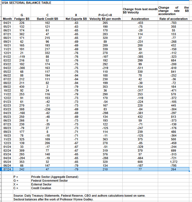
The table below shows the sectoral balances for the US, which are produced from the national accounts.
A positive private sector result for July that just ended and is supportive of risk asset markets.
Last month should have been a flat to weak stock market based on the weak fiscal flows and indeed that was more than the case given the big drop we had, which a V-shaped recovery has followed up. It was a bottom that should have been bought or ridden out. This month, the flows are much stronger and the V-shaped recovery and a general push higher is possible based on the fiscal flow result for July that knocks on into August.
In July 2024, the private domestic sector recorded a surplus of $210B. This is a positive result for asset markets, as financial balances in the private sector have risen by this much. Note that the result for the preceding month was reduced due to a reporting error of many billions by the treasury department, further reinforcing the weaker market scenario.
From the table, one can see that the $210 billion private domestic sector funds surplus came from a strong $242 billion injection of funds by the federal government (and this includes the new injection channel from the Fed of around $6B from interest on reserves that went directly into the banking sector), less the -$79B billion that flowed out of the private domestic sector and into foreign bank accounts at the Fed (the external sector X) in return for imported goods and services. Bank credit creation contributed $47 billion and much weaker than last month.
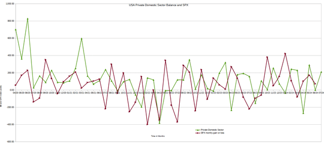
The chart below shows the sectoral balance data plotted in nominal terms. The calculation is federal government spending or G, plus the external sector (X and usually a negative factor) to leave that amount of money left to the private domestic sector, or P, an accounting identity true by definition.
Last month the chart predicted the SPX would be flat to weak and in reality, it proved to be very weak with a solid retracement taking place that has since become a strong V-shaped recovery. This chart gives a sense of direction, however, is not able to show the depth and strength of a possible move. The strength and depth of the stock market retracement were much stronger than I expected, given that for most of the year, the stock market has driven higher and ignored weak fiscal conditions until now.
This month, the news is much better. The private domestic sector flow is in positive territory and the V-shaped recovery is likely to continue, and the month will end higher than it began.
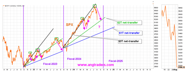
This matter of the stock market retracement we have seen over recent weeks deserves more attention and the chart below shows how as the overall strength of the fiscal flows from the federal government has weakened the stock market has adjusted its trajectory and reset at a lower level.
The SPX has dropped closer to the average level for a $2T/year net-transfer rate of change. When we combine the Treasury net-transfer with the bank credit and the Fed’s negative remittances, the transfer amount is ~$2T, so that gives some fundamental support.
Source: ANG Traders at the Away from the Herd Seeking Alpha Investment Group chat.
As the federal government deficit spending has lessened over time, the stock market has adjusted its upward trajectory to a shallower incline. While federal government deficit spending at $3 trillion per year, the stock market was tracking the black dotted line. This trend continued into overtime over the last 6 months, even as fiscal flows slowed to only $2 trillion per year. As with all natural laws, such as gravity, reality asserted itself and markets fell and adjusted down to touch the $2 trillion deficit spending line shown as a green dotted line.
The most likely scenario from here is that markets now move back upward but start from a lower base and rise less steeply in line with the weaker overall fiscal flows that come chiefly from the federal government. The stock market would now follow the green dotted line, representing a lower overall fiscal injection of money into the private sector.
This macro scenario can only change if the fiscal flows increase from another sector, such as a boom in bank credit creation or a drop in the current account deficit that allows more money to flow into the private domestic sector where the stock market is located.
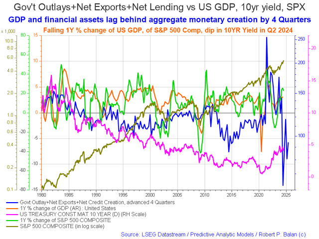
The following chart emerges when one graphs the change rate of the information in the US sectoral balances table above and adjusts for impact time lags. This is like a long-range market radar set.
The chart above shows that US fiscal flows [blue line] are spiking up from now and into the end of 2025, which tends to push asset markets up and provides a strong undercurrent upwards, and goes some way to explain why markets have gone so well this year even though the fiscal flows from month to month have only been moderate at best.
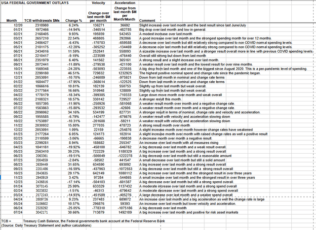
The table below shows the total federal government withdrawals from their account at the Federal Reserve Bank. A withdrawal by the federal government is a receipt/credit for the private sector and therefore a positive for asset markets.
The table shows that total outlays increased nicely over the previous month and are moving in the $3 trillion-plus range again. Large month-over-month increases like this one have large monetary velocity and acceleration effects on asset markets in a positive way and we are seeing this so far this month.
The federal government has another major tax collection event coming up in the middle of September. This month has the benefit of a large treasury interest payment in the middle of the month and then another smaller one at the end of the month.
These flows produce a local seasonal bottom in the middle of August and rise until about the twentieth of September.
The next Fed meeting is in the middle of next month, when most likely rates will be paused or a small raise might come. While there will be no Fedspeak this month to excite markets, the world central bankers are meeting in Jackson Hole in the middle of this month and the official statements that come out of that meeting can be just as important as official fed meetings.
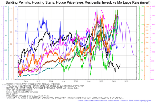
On the larger world macroeconomic side, we have the G5 chart below. The chart shows the level of money creation by the top five world governments (the G5) in a change rate format, along with a host of other indexes. This chart gives a sense of important inflection points and direction.
The chart shows that the purple G5 fiscal flow line generally rises upward into 2025 and provides a strong financial undercurrent for asset markets going forward. This combined with the stronger national-level fiscal flow background provides a firm ground for national asset markets to advance.
Interestingly, the chart shows the all-important purple line declining after 2025, which links in with the forecast for a major boom-bust in the housing market within a year of that time. The blue line on the first chart in this article points to the same phenomenon.
While housing prices continue to rise, they are doing so on thinner and thinner volumes, which makes the price structure fragile and where a lack of buyers and thin volumes can cause large changes in house prices. This is a similar process to a stock price trading higher on low volumes and then dropping fast when a big sell order and a lack of buyers happens.
The problem with the housing market being fragile is the borrowing that is leveraged against it. When real estate asset prices fall and bank asset-to-equity ratios are exceeded, it starts an automatic bank run as loans are called in to meet financial regulations. This happened in the 2006-09 global financial crisis. The real estate market is very large and leverages a lot of private debt, and that is why such a situation represents a systemic risk.
Below is a series of charts that document how the fundamentals behind house prices are decaying even while the price of land still climbs.
Property Share Markets Economics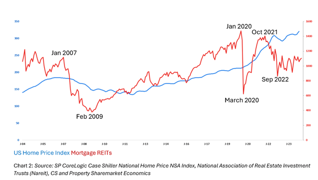

While the blue land price index still climbs, mortgage REITS peaked and fell for this real estate cycle years ago and are now trading sideways and when the peak and crash come will most likely see again their 2009 lows. mREITS is definitely a sector to steer clear of for many years to come.
Property Share Markets Economics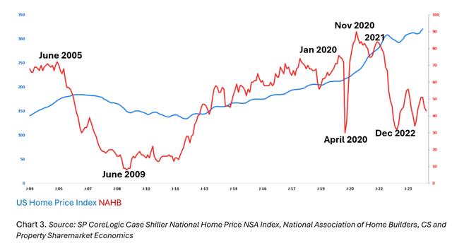

The home builders index has fallen and is making lower highs and like the mREIT index is likely to see the 2009 GFC lows in the next few years.
Property Share Markets Economics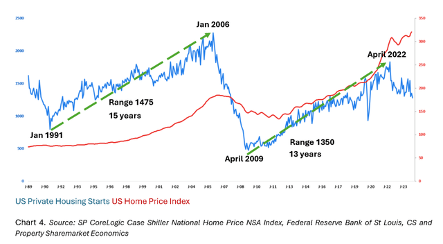

US private housing starts have peaked for this cycle and are working their way lower as the steam goes out of the markets. The higher price of land makes it less and less attractive to build a home, even while the population grows larger. The result is a house and land price squeeze upwards as more people compete for a lower supply of new housing and end up paying more for less. Winners will be cursed with negative equity, or worse, a loan foreclosure and no home when the bank calls in the loan in the cycle downturn after 2026.
Tactically, there was a dip to buy as a result of the June tax collection knock-on effect into July. The strength of the V-shaped recovery shows that risk asset markets have a lot more to give before peaking out and markets are likely to keep on rising into September, the expectation is that markets will generally rise into 2025 as well with only minor seasonal dips along the way.


