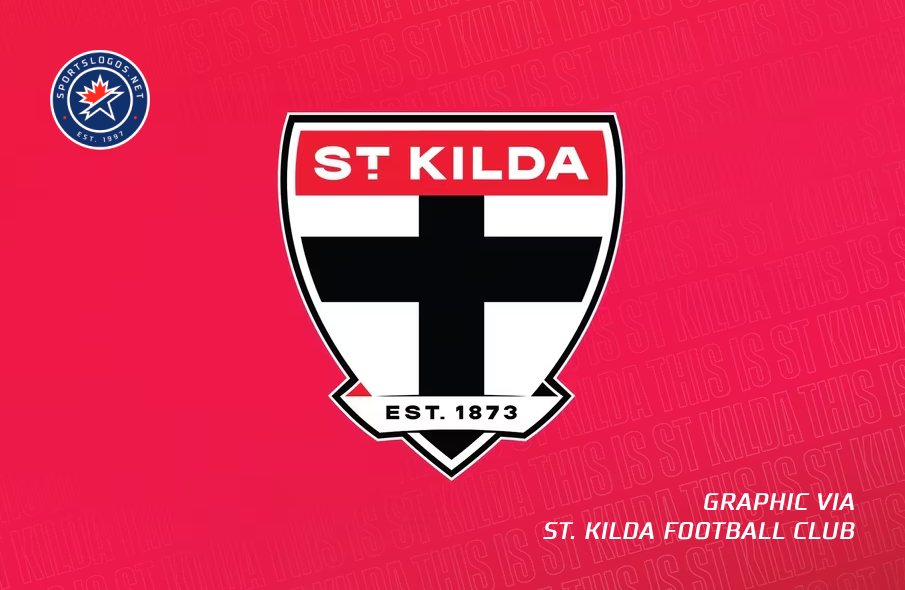
Melbourne-based St. Kilda Football Club of the Australian Football League are ready for a new era after unveiling a new, modernized crest.
The club launched the crest on Tuesday, November 19, making them the third AFL club to unveil a new crest in recent weeks, following Adelaide Crows and Gold Coast Suns. It follows much the same design as the club has used for more than 90 years, but with elements streamlined and modernized “for 2025 and beyond.”
“An enduring symbol of the Saints for over 90 years, the Crest has long been a treasured and integral part of the club’s identity, having featured on every St Kilda guernsey in various shapes, sizes and iterations since 1933,” the club’s website says.
The centerpiece of the crest is a shield, which is the same shape as the shield in the previous version of the crest, which the club adopted in 1995. A red banner at the top reads “ST. KILDA”, a change from “St. K.F.C.” in the previous version. Below the banner, a black cross sits on a white background. A ribbon across the bottom features the club’s establishment year of 1873; the shadow behind the ribbon is red on the left side and black on the right side, mirroring the ends of the ribbon on the previous version.


Due to the unified nature of the new logo, the Crest is now able to be enlarged in key areas, such as on the front of the guernsey, and also minimised to better suit a raft of digital placements in the modern age; a key consideration during initial ideation.
“We’re incredibly proud to reveal our new Crest as we look to set ourselves up for a strong and prosperous future,” St Kilda CEO Carl Dilena said on the club’s website. “To be successful, we’ve got to be prepared to innovate and push boundaries. This bolder, more powerful logo symbolises that, while also paying important homage to our history.”
The club’s Latin motto, “FORTIUS QUO FIDELIUS” (“Strength Through Loyalty”), which formerly appeared in the ribbon under the shield, will now appear on the hemlines of St. Kilda guernseys going forward.
Speaking of guernseys, those unveiled alongside the new crest followed St. Kilda’s traditional look, with red and black stripes on either side of a white block in the center, mirroring the colors in the crest ribbon. The crest itself appears in a black box on the left chest, under a sponsor logo, with the AFL logo on the opposite side.
While St. Kilda was founded in 1873, they only adopted their crest in 1933.
St Kilda’s Crest originated in 1933 and was immortalised into club legend later that same season in the aftermath of the famed ‘Crest Game’; a match wherein an undermanned and injury-ravaged Saints outfit — with just 15 players on the field — toppled a ruthless and full-strength North Melbourne in one of the club’s most stirring triumphs.
In commemoration of the achievement, then-President Fred Arlington-Burke commissioned medals adorned with the Crest to be struck for every player who took part in that game. The Crest has since embodied a legacy of resilience and perseverance no matter the odds; traits synonymous with the Saints over the past 151 years.


Work on the redesign began in September 2023 and involved “extensive research, conceptualisation and consultation among a randomised selection of members and fans, current and former players, key club personnel and the Board arriving at the striking new look seen today.”
“We understand the significance of modifying such an iconic symbol, so ensured we engaged in a thorough consultation process with a range of stakeholders from a cross-section of our diverse supporter base,” Dilena said. “Through these focus groups, clear themes were identified as integral for our club’s logo. Most importantly, retaining the Crest itself was a non-negotiable.
“We fully understand how important the symbol is to everyone affiliated with St Kilda and hope this change to a modernised and updated Crest continues to uphold what our club proudly stands for.”
More details about the new crest are explained in this YouTube video:

