Fans of international rugby are blowing the whistle after one of the sport’s oldest and most prestigious competitions launched a rebrand this week.
The Six Nations Championship dates back to 1883 is contested every year between England, France, Ireland, Italy, Scotland and Wales. But in an attempt to “recharge” the competition moving forward, the tournament unveiled a new logo on Monday, December 2.
The centerpiece of the rebrand is a gradient rugby ball that fades from black in the middle to a colour on the outside depending on the competition. The Men’s Six Nations logo features a red ball with “M6N” in yellow and orange, while the Women’s Six Nations logo has a purple ball and a purple “W6N” overtop. The M and the W are mirror images of each other, fashioned to look like a lightning bolt with “a sparky spirit and form.” Both the men’s and women’s logos also include the logo of title sponsor Guinness.
There’s also a version with a neon green ball, a smaller U an no Guinness mark for the Six Nations Under 20s Championship.


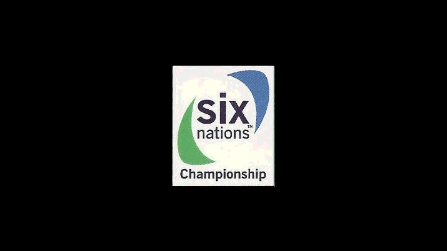
Since five nations became six in 2000, and our previous “6 ball” brand launched in 2003, M6N and its fans have transformed. The reimagined brand is distinctive, modern and allows us to be seen more vividly in places and in spaces. It will enhance broadcast viewing, wow audiences on digital and excite people in the stands, while our “Since 1883” tagline pays tribute to all the history that has led us to where we are now.
But fans are not happy with the new logos, calling them “absolutely shocking” and “awful,” according to The Independent. Others likened them to the logos for the video game Crash Bandicoot or for Mars bars.
“Cheap, tacky and hideous,” another social media user replied. ” “Rugby is seemingly on the decline, for many reasons and now they’re trying to alienate what remains,” another said.


Design Week editor Rob Alderson told BBC Sport he was surprised by the change, but he was cautiously optimistic it would age well. “It didn’t feel to me like the Six Nations,” he said. “But that might be exactly what they are going for. If they are trying to expand the Six Nations to reach new people, something that doesn’t feel like the Six Nations is probably quite a smart move.
“The problem is we get this stuff as a visual, without the context of what they were going for or how it will be used. We haven’t seen it in context, on kit, in stadiums or in on-screen graphics.”
Alderson likened it to the logo for the 2012 Summer Olympic Games that were held in London. “People hated that logo when it came out in 2007, but by the time the Games came round and people saw it on different things and around London, minds had changed and it had become sort of loved.
“People took a lot of patriotic, creative pride in it. That does happen once you see things in context. In some ways, it is a good sign you get a strong reaction, because that shows people care. If you roll out a new logo and everyone shrugs, you haven’t done a good job or people don’t care that much about what it is attached to.”


The Six Nations Championship dates back to 1883, when it started as a contest between the four Home Nations of the United Kingdom: England, Ireland, Scotland and Wales. It became the Five Nations Championship in 1910 when France was invited to join. It stayed that way for 90 years until Italy joined in 2000 to make it the Six Nations Championship.

The 2025 edition of the Six Nations tournament begins on January 31 when France hosts Wales in Paris.


