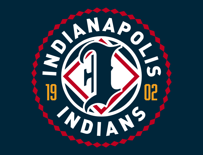

The Triple-A Indianapolis Indians, an affiliate of the Pittsburgh Pirates, unveiled a new brand that largely moves away from the use of Native American imagery and iconography, but maintains the longstanding Indians nickname. The new look is centered around a stylized blackletter I, with the primary logo prominently highlighting the year of the team’s founding, 1902.
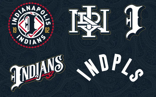
The suite of logos includes two cap logos, including the I from the primary logo and an intricate interlocking INDY. Two different wordmarks spell out Indians and the abbreviation INDPLS for Indianapolis. The foundational color for the updated brand is dark navy, with red and yellow used as highlights.
The new look replaces an identity that had been in use since 1995 (above), which centered heavily around the use of Native American imagery. While the updated brand is less explicit, there is still one element that connects the visual brand to the name: The primary logo is “enclosed in a tribute to Native American ribbon work,” per MiLB.
As some professional teams have moved away from Native American-based brands in the interest of cultural sensitivity, Indianapolis has remained steadfast to the name baseball teams in Indianapolis have used for 124 years.
“As announced in 2023, the team name will remain the ‘Indianapolis Indians,’ as the organization continues to partner with and learn from the Miami Nation of Indians of Indiana (MNI) and other experts to be the best stewards of the name,” MiLB said on its website.
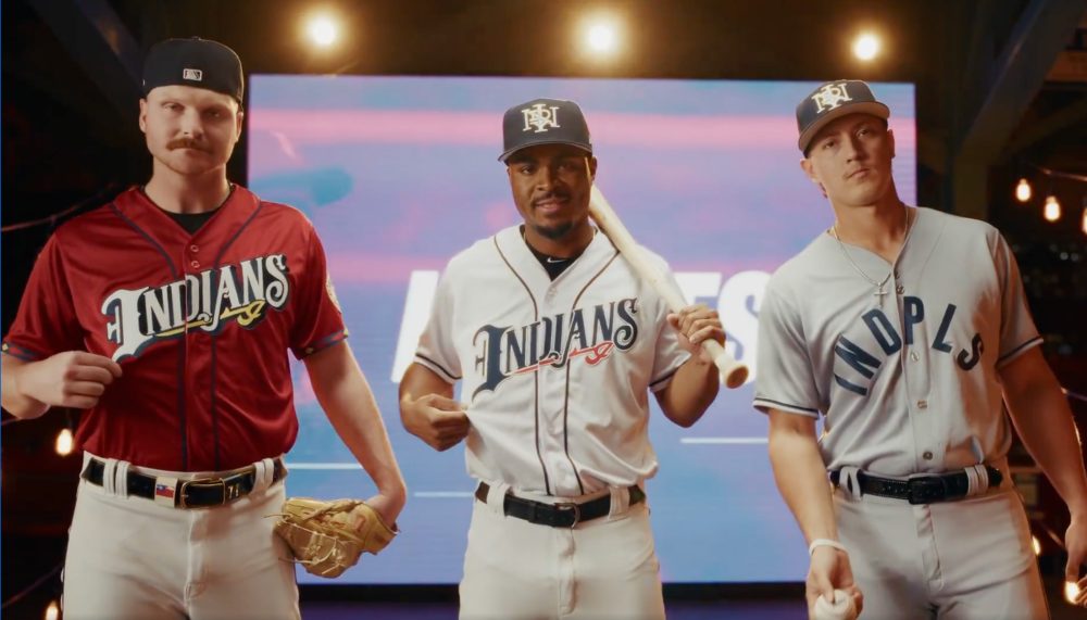
Indianapolis will wear white home uniforms and red alternates that feature the Indians wordmark, and road grays with INDPLS, because 5 letters are better than 12.
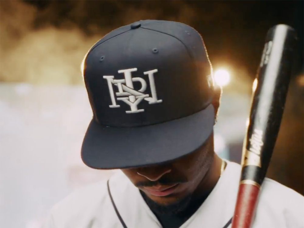
The interlocking cap logo is new, but it’s meant to feel classic, evoking an aesthetic from the early 1900s.
Indy will debut its new duds at home against the St. Paul Saints when the International League season begins March 27, 2026.