The body governing international ice hockey is going on the power play with a new “modern, fan-focused” visual identity.
The International Ice Hockey Federation — which oversees world championships at all levels, the Champions Hockey League and IIHF Continental Cup in Europe, and the hockey tournaments at the Olympic Games — rolled out the new identity on Friday, October 3, at their semi-annual congress in Nice, France. This marks the first time the IIHF has updated its brand in nearly 20 years.
The new identity was developed by TwelfthMan, a sports-focused design agency based in London, England, that has previously produced work for Manchester City and the English FA.
TwelfthMan were tasked with creating a modern identity that supports the IIHF’s approach to strengthening its global presence and its on-going brand strategy to engage more closely with ice hockey fans around the globe. The brand includes an updated logo and wordmark, visual identity, graphic language, colour palette and bespoke font built around the brand essence Home Ice.
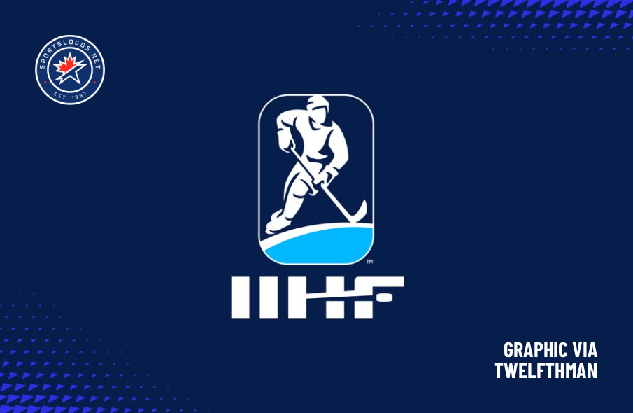
TwelfthMan worked closely with renowned icon artist Chris Mitchell to create the logo, which retains the IIHF’s brand equity by maintaining the silhouette of a player and its distinctive rink shape, but the gender-neutral player is now given more prominence and character.— IIHF press release
One of the most noticeable changes is the incorporation of a moving puck into the IIHF wordmark in the primary logo, which gives it “a clear ice hockey reference as well as dynamism and personality.” The hockey player has been redrawn, and the box around it and the light blue swoop underneath has rounded corners like a hockey rink. That rink is an integral part of the brand, appearing in multiple applications both with and without a triangular halftone blur.



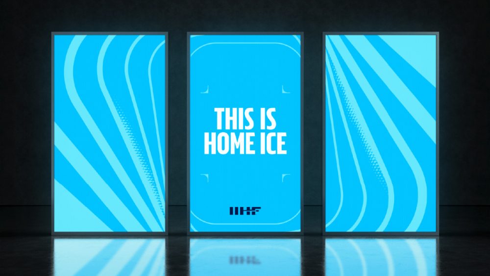
The new identity also incorporates a brand-new bespoke typeface that “captures the energy of the game with the flexibility to work in multiple tones across all levels of IIHF communications, from clear and confident to engaging and expressive.”
“This new brand represents more than just a visual update — it’s a statement of who we are and where we are going. Home Ice reflects our belief that every fan, player and partner should feel a sense of belonging in the global ice hockey community. With this evolution, we are building a platform that is inclusive, modern, and ready for the future of our sport.”
— Matti Nurminen, Director General, IIHF
“It has been a very collaborative process with the IIHF and we feel the new brand really captures the essence of the sport and their organisation,” added TwelfthMan creative director Mark Pidgeon. “We needed to make sure that the brand would work across the IIHF’s many different competitions and initiatives as well as having the flexibility to speak to a wide-range of people, from governance to more expressive fan-focused content. We are really looking forward now to seeing the brand come to life.”
In years past, IIHF competition logos would mirror the shape of the federation’s main logo, with unique graphics inside. It’s not yet clear if this will continue moving forward.
The next major IIHF national team competition is the World Junior Championship, which begins on Boxing Day in St. Paul and Minneapolis, Minnesota.


