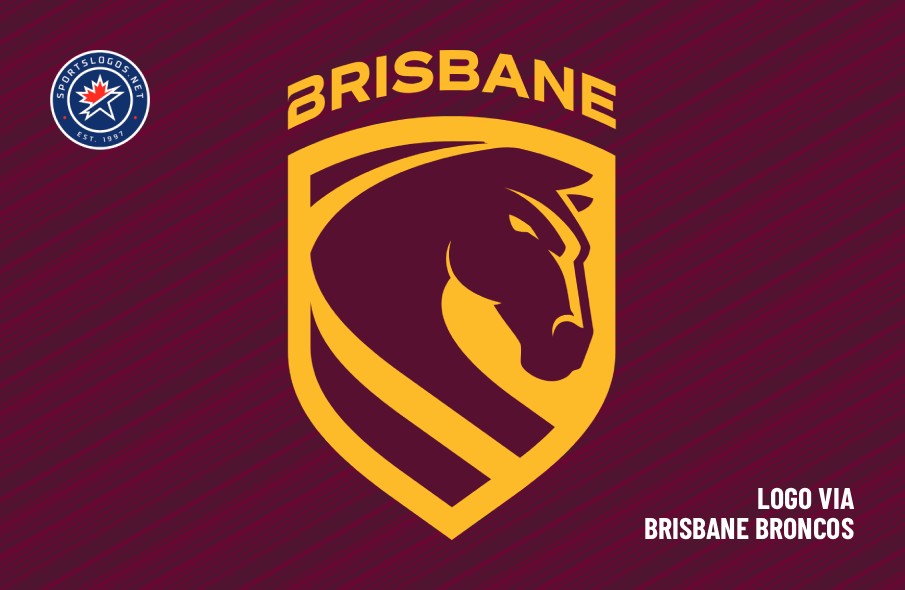
The defending champions of Australia’s National Rugby League are revving up the horsepower with a redesigned crest and accompanying logos.
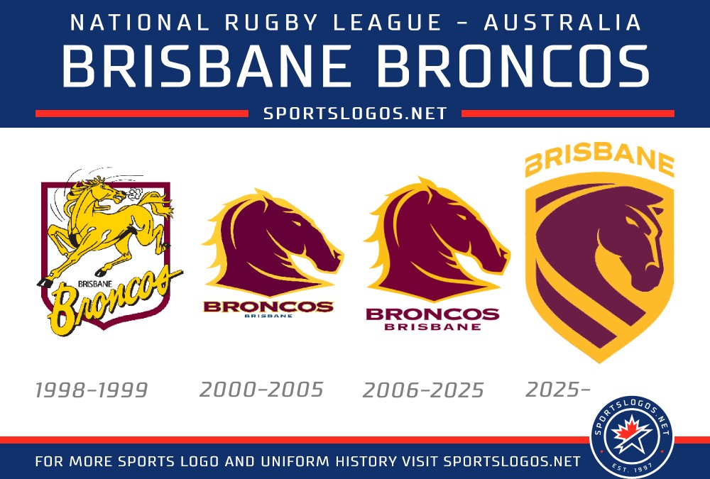
The Brisbane Broncos unveiled the new crest, along with home and away kits for the upcoming 2026 season, earlier this week with events around the city. It’s the first time the Broncos have substantially changed their logo in more than 20 years.
The new primary crest retains Brisbane’s traditional maroon and gold colour scheme, but puts the horse’s head inside a shield, which is a nod to the club’s first crest from 1988. The horse is “staring unflinchingly into the future,” while the stripe at the bottom of the shield represents the Brisbane River, “relentlessly flowing forward.” “BRISBANE” is arched over the top of the shield.
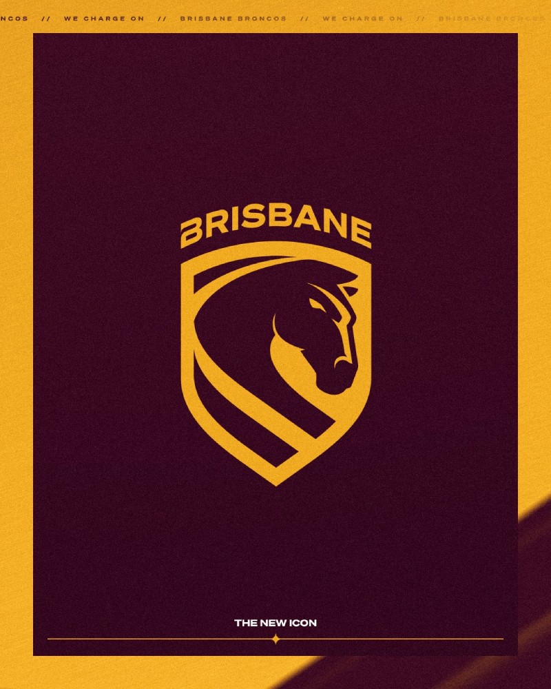
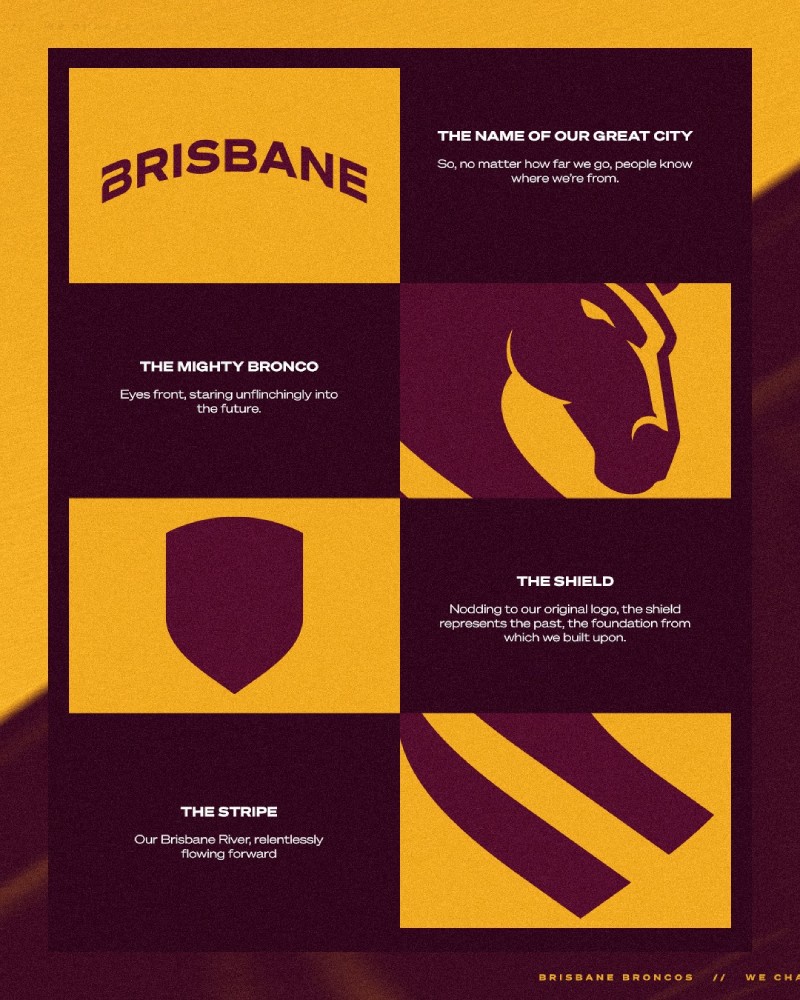
From the city skyline to the bush, from golf greens to maternity wards, the Broncos’ rebrand launch delivered a powerful message: a new era has begun, grounded in Brisbane pride and built for the future.
As the first day of the Club’s chapter draws to a close, one thing is clear – Brisbane is ready to Charge On.
— Brisbane Broncos
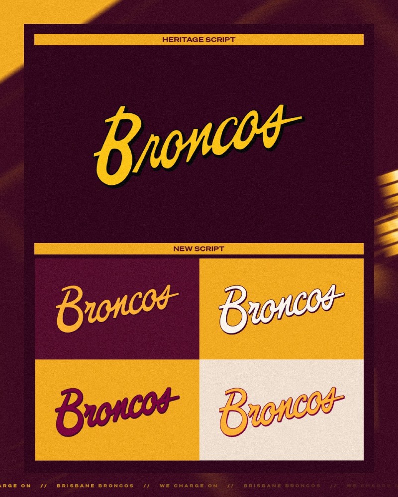
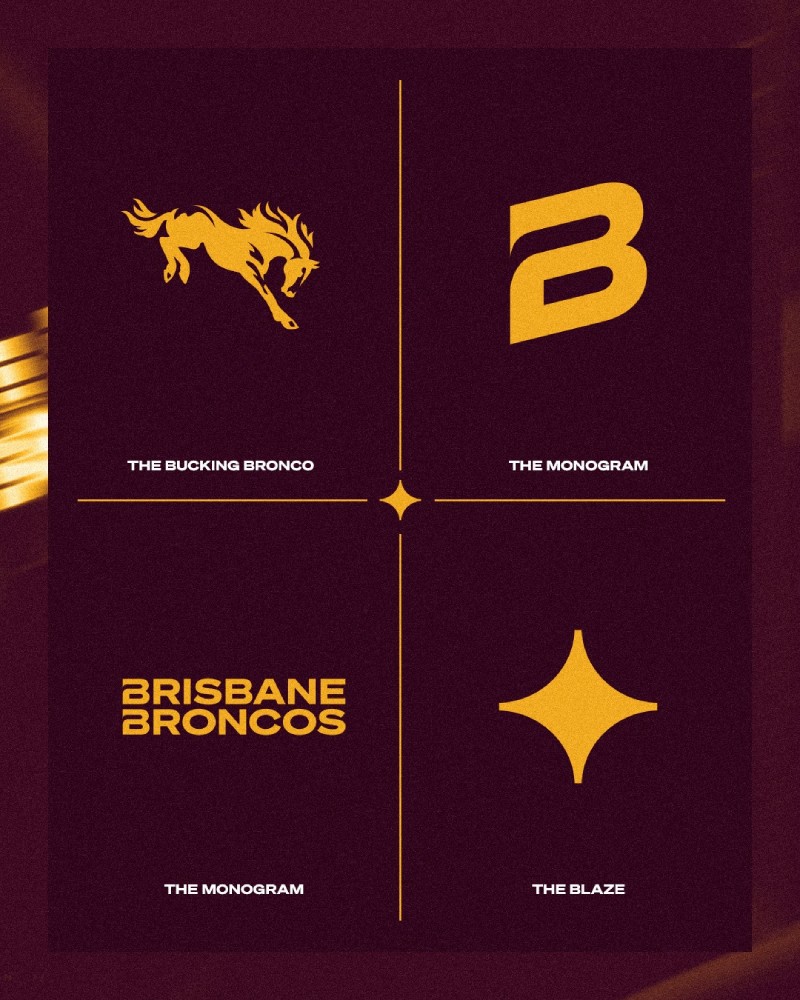
Along with the crest, the Broncos also introduced a new script wordmark, another nod to their inaugural crest. Other secondary marks include a bucking bronco, a modified “B”, a wordmark with the full team name, and a mark they call “the blaze” that appears throughout their digital graphics.
Reaction to the new logo among Broncos fans on social media has been mixed. Club legend Lote Tuqiri told Australia’s Nine Network that it doesn’t “scream toughness.” “It’s a bit weird; they’ve spent a lot of money on something that looks pretty plain,” Tuqiri is quoted as saying in the Daily Mail. “It looks a bit like that chess piece, the knight.”
But Broncos CEO Dave Donaghy has defended the new crest, telling SENQ radio: “From where I sit with the feedback I get and some of the polls I’ve seen, it’s been really positive and I don’t think (the launch) could have gone any better.”
“We know (the previous Broncos logo) has really strong emotional connection to our members and our fan base—but the current form is circa 20 years old and in its fullness its actually north of 25 years,” Donaghy is quoted as saying by The Sporting News. “When you reflect back on that period, it was created before the iPhone and smartphone tech… and we didn’t think it was going to provide us with the flexibility we needed with a younger audience.
“Ultimately as CEO I take ownership and responsibility for it, but there were many people who played a really significant role over the course of those 18 months—and we saw many different options. We think it’s a really powerful look and we’re excited about where it takes us in the future.”
The crest unveiling was accompanied by the introduction of the Broncos’ home and away kits for 2026, made by Asics. The home kit maintains the traditional maroon base, with gold stripes around the midsection and the sleeve cuffs along with white details on the collar and collarbones. The away kit, meanwhile, is a tribute to legendary Queensland rugby player Cyril Connell, who also served as chief talent scout for the Broncos in the 1990s and 2000s. The Broncos’ main training facility was named after him in 2007.
The Broncos originally wore a kit honouring Connell in 2010, a year after he passed away, and the 2026 away kit is a take on that jersey. It features a navy blue base and seven white stripes around the midsection, along with a white collar, tapering white stripes on the collarbones and maroon and white stripes on the sleeve cuffs.
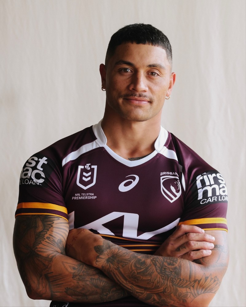
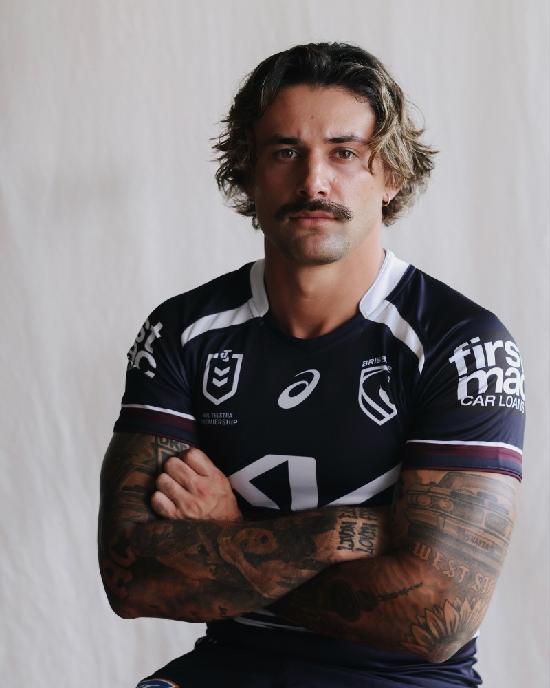
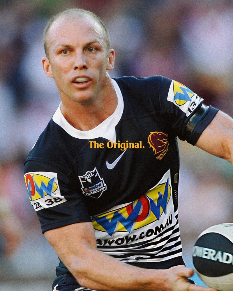
The Broncos won the 2025 NRL Premiership with a 26-22 win over the Melbourne Storm on Sunday, October 5.
The 2026 NRL season kicks off on Saturday, February 28, with a pair of matches at Allegiant Stadium in Las Vegas: Canterbury-Bankstown Bulldogs vs. St. George Illawarra Dragons and Newcastle Knights vs. North Queensland Cowboys. The Broncos’ season opens with a home game at Suncorp Stadium in Brisbane against the Penrith Panthers on Friday, March 6.


