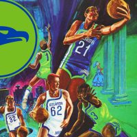

Just two years after they relocated from St. Louis, the Atlanta Hawks made a splash in the NBA with a radical new look that marked a significant shift in their identity and left their old recycled St. Louis Hawks uniforms far in the rear-view mirror. The team introduced a bright, bold colour scheme and uniform design that stood out sharply from the traditional NBA palettes of the time.
On the afternoon of Wednesday, September 9, 1970, the Hawks unveiled three new uniforms for the 1970-71 season. Unveiling three uniforms isn’t that notable here in 2024, but back in 1970, it was considered very unusual. The team even claimed this was the first time a pro basketball team had ever had three uniforms at once.


All three uniforms featured the city name of Atlanta across the front rather than “HAWKS,” making it clear this was now Atlanta’s team (Hawks was moved down to the side of the shorts); all three featured the Hawks’ vibrant new colour scheme of lime green, blue, and white. The all-white uniforms had “ATLANTA” and the player’s number on the chest in blue, a blue line curving down from the left shoulder, across the collarbone, and heading down the right side joined by two others – one green, one blue; this same striping pattern repeated on the back of the jersey. The other two uniforms used the exact same style but with the colours swapped around. The new all-blue set saw the name and numbers changed to white with a green line curving across the front. Their all-green set changed both the team name and curved lines to blue. If the goal was to turn heads, well, mission accomplished.
This dramatic redesign was part of a broader trend across the design world, not just in sports, towards modern and progressive aesthetics. The uniforms were described in the local Atlanta newspapers as embodying a “mod” look, with one reporter saying the new warm-up gear looked as if it was straight from London’s trendy Carnaby Street.


The new uniforms were unveiled by Atlanta Hawks team captain Bill Bridges and the team’s first-round draft pick “Pistol” Pete Maravich. Maravich used the event to debut his new number 44—which resulted in one fan in attendance making a comparison to Atlanta Braves baseball star Hank Aaron. Maravich would certainly live up to Aaron’s huge legend with a Hall of Fame career, which included 5 All-Star appearances, a scoring championship, and posthumously being named to the NBA’s 75th Anniversary team in 1997.
The unusual use of three different uniforms raised questions about what and when uniforms would be worn. The team said there was no fixed plan for what they’d wear during home or road games. One media member in attendance lightheartedly suggested they simply pick a uniform and wear it each night until they lose, then switch to the next.


As was the case with all new uniform announcements of the era, the press seemed to take more interest in the other news presented at the event—in this case, the team adding 1,000 new parking spaces around their home arena, Alexander Memorial Coliseum.
Despite all the buzz, the green and blue uniforms were short-lived. Unappreciated in its time. On July 6, 1972, less than two years later, the Hawks introduced a new logo and new uniforms featuring a return to red and white while adding the new gold to their colour scheme. This move coincided with their move to The Omni and matched the look of their new roommates, the NHL’s expansion Atlanta Flames. The new logo featured a new hawk’s head logo designed by local branding agency McDonald and Little. Later nicknamed the “Pac-Man logo” it was used by the Hawks for another 23 years, replaced during the massive sports re-design of the 1990s. The logo would eventually go on to become the club’s signature look and was re-adopted full-time by the Hawks in 2015, still in use today.

While they only lasted two seasons, the green and blue era of the team wasn’t completely forgotten over time. Twice, the uniforms were brought back as “Hardwood Classic” throwback uniforms, with the green set coming back briefly in 2003-04 and the blue in 2016-17. The Hawks switched back to blue as their main colour from 2007 to 2015 and added “Volt Green” as a secondary colour from 2015 to 2020, and there was even one season the Hawks wore a black and green “City Edition” uniform that mimicked the curved line design of that original set.
History has a funny way of repeating itself, especially in the sports uniform world. The second era of the Atlanta Hawks in green was once again ended so the team could wear gold, with the team re-adopting their red, gold, and white colours for the 2020-21 season—the exact same season in which the NHL’s Flames, now located in faraway Calgary, switched back to their original red and gold colour scheme. Funny.

