
The Australian Football League’s Gold Coast Suns are hoping for the dawn of a new era in club history with a new logo.
The club unveiled the logo on their website and social media channels on Friday, November 15, and then celebrated with supporters at an event at a park in Burleigh Heads, a suburb of the city of Gold Coast, Queensland. They also kicked off a new marketing campaign branding themselves as “Fearless” as they head into their 14th AFL season.
The centerpiece of the Suns’ new brand is the new primary logo. It’s comprised of three key elements, according to the club:
- The scorching Sun of the Gold Coast rising over the ocean and horizon.
- The bold “S” that represents the SUNS and the community who have built the Gold Coast.
- A football at the logo’s heart, signifying our purpose and commitment to excellence.


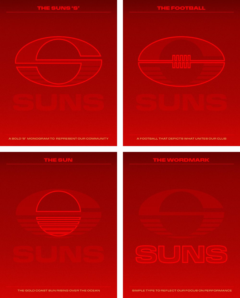

There are also subtle G and C characters hidden in the design, “a nod to our history and original logo. Together, these elements capture who we are, where we’ve come from, and what we strive for on and off the field.”
“We knew after 14 years with the same brand that it was time to update our look and feel to better represent how we have evolved and matured as a football club,” said Suns CEO Mark Evans. “Our new logo is modern, bold and innovative, with layers of context which speak to our history and purpose. We’re excited to show the world our new brand, and tomorrow we will reveal our new guernsey and colour palette, marking the start of our new era.”
Along with the logo, the Suns unveiled their new guernseys, made by New Balance, for the 2024-25 AFL season. They’re mostly red, with a tonal version of the primary logo on the chest. Curving tonal pinstripes adorn the sides of the guernsey and extend onto the shorts, where a pale gold version of the logo is placed on the left leg. Numbers on the back of the guernseys are the same shade of pale gold.


The Suns joined the AFL in 2011, and this is the first time they’ve done a major overhaul on their visual identity. Their previous logo was a red oval with a yellow outline, the letters “GC” inside in yellow and a blue shadow. “SUNS” was written out in red underneath, arching to match the curve of the ball. An alternate version featured sun rays emanating from the center of the football.


The Suns are the second of three AFL teams who were reported to be unveiling new logos this offseason to do so. The Adelaide Crows unveiled a new logo but no guernseys earlier this month. The third reportedly changing up their logo is St. Kilda Football Club, based in Melbourne.
The Suns open their 2025 AFL Premiership season at home against the Essendon Bombers on Saturday, March 8.


