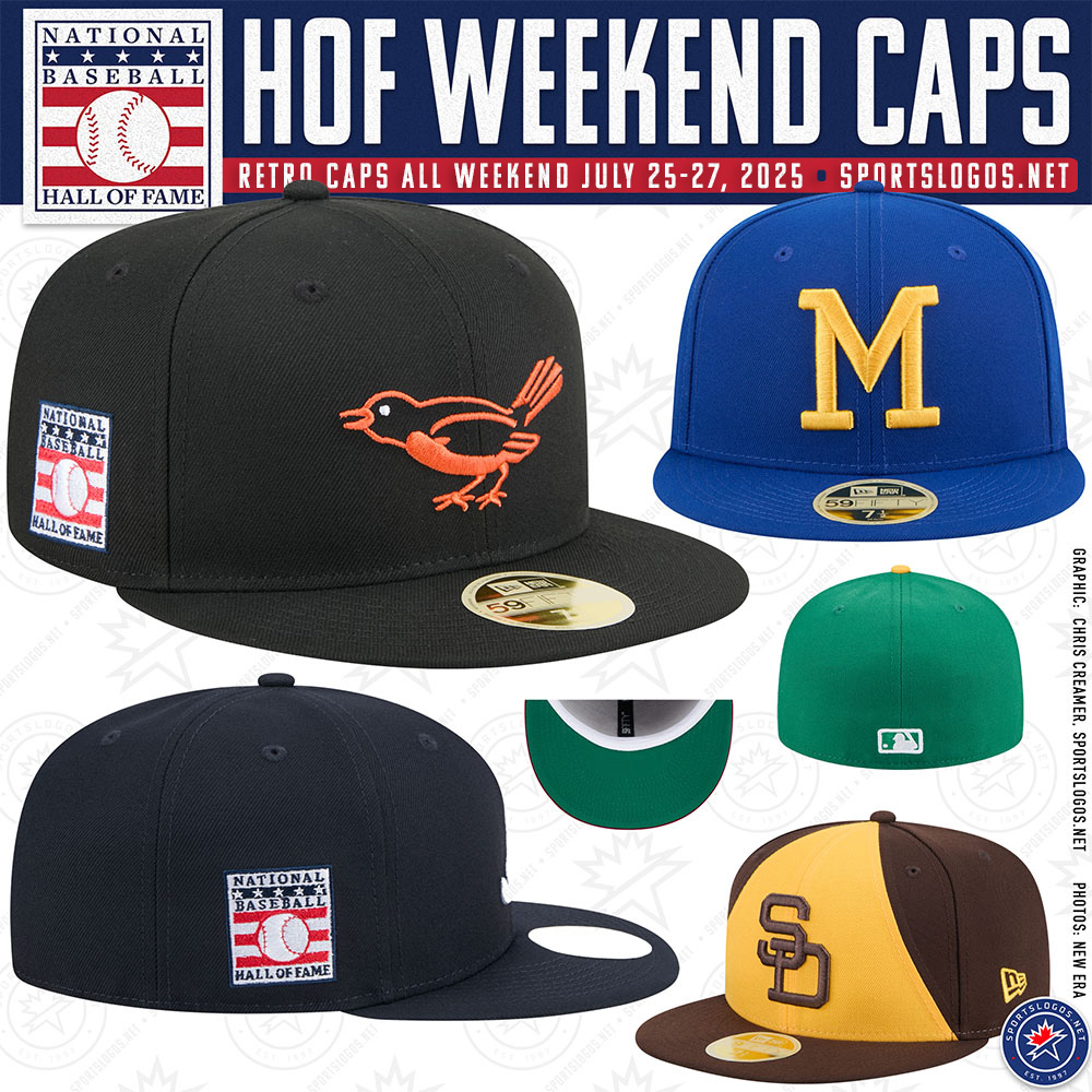
Major League Baseball will honour this year’s Hall of Fame induction weekend with a look back into the past across the league as all 30 teams wear retro-style caps during games played July 25 through 27. It marks the first time every club has worn a specially designed throwback cap for the occasion.
The caps, each designed by New Era, feature a retro or retro-inspired team logo, a vintage look and feel construction, and a commemorative Hall of Fame patch stitched to the right side. While caps will change for the weekend, jerseys will remain the standard 2025 team uniforms.
SHOP: Get your retro-style 2025 Hall of Fame caps right now, they’re going fast!
Tim Shanahan of New Era explained that the concept originated from years of teams holding individual “Turn Back the Clock” nights and evolved into something more cohesive.
“It’s our way to work with baseball to celebrate the Hall of Fame,” Shanahan said. “We started off our design process by pitching just what every team’s first fitted New Era cap looked like. So the early ’90s were our overall starting point.”
Shanahan noted the designs were finalized six months ago, with each team given the opportunity to tweak designs to reflect their own club history, colours, or other anniversary tie-ins.
“If a team wanted to celebrate a Hall of Famer or a particularly memorable season, they can make adjustments,” he said. “Some teams have a much larger breadth of on-field designs, such as the Marlins. Other teams, like the Rockies, have stayed more consistent, so for those, we added features like white sweatbands or green undervisors to still give it that retro Cooperstown feel.”
This is the second straight season in which Major League Baseball has recognized Hall of Fame Weekend with a special on-field cap patch. However, it’s the first time all clubs will wear specially designed caps for the occasion.
Here’s a breakdown of what each of the 30 teams will wear this weekend (just a heads up, the team-by-team photos may not be complete when you’re reading this, we’re dealing with some severe weather in my region tonight, so I’ll be updating this as we go to ensure we have at least SOMETHING up in case of a power outage)
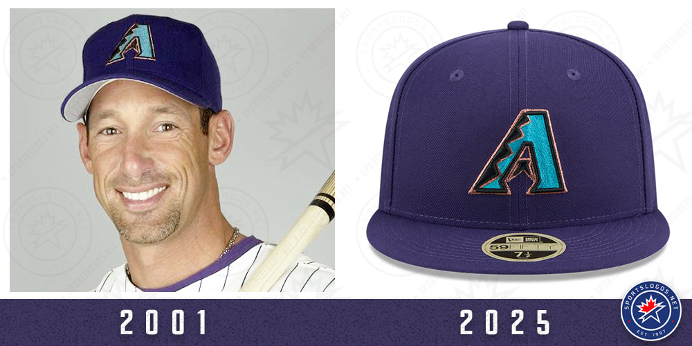
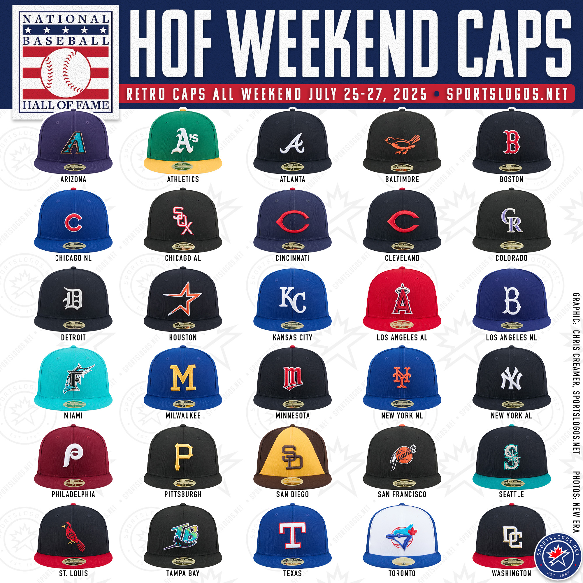
Arizona Diamondbacks
A purple cap with the original teal “A” logo, worn by the D-backs from 1998 to 2006, including their 2001 World Series title season.
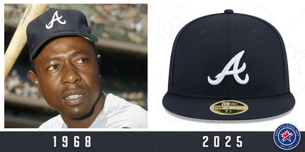
Atlanta Braves
All-navy cap with the scripted “A” logo, a style worn from 1968–71 and again in recent years as the road cap. Atlanta wore this cap during their 2021 World Series championship run.
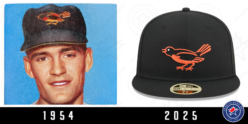
Baltimore Orioles
All black cap featuring the team’s original Baltimore Oriole bird logo, worn from 1954–57 following the franchise’s move from St. Louis.
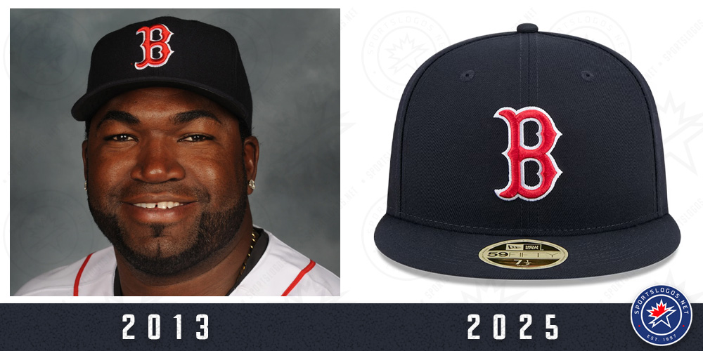
Boston Red Sox
Their current red “B” on navy blue cap, which has remained in use since 1979 and has seen four championships (2004, 2007, 2013, 2018).
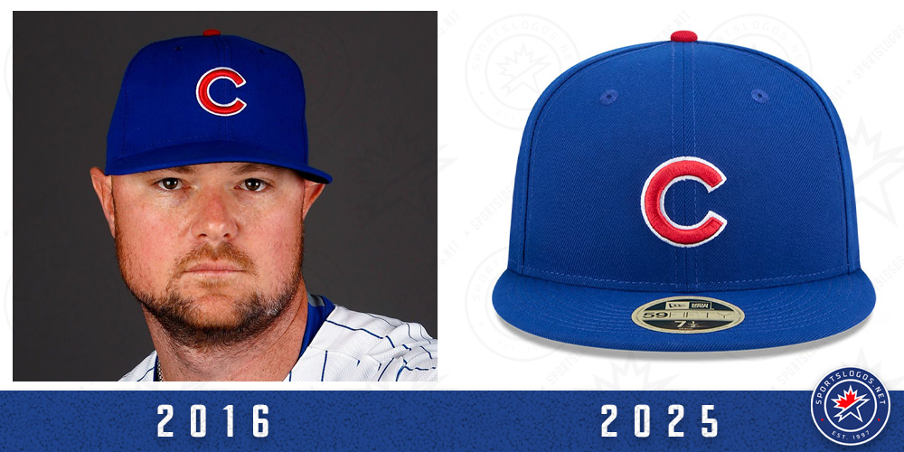
Chicago Cubs
The all-blue cap with red “C” the team has worn continuously since 1959, including their 2016 World Series win.
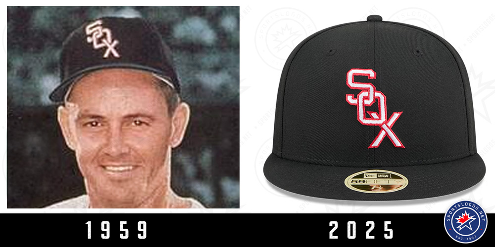
Chicago White Sox
An all-black cap with a diagonal “SOX” logo in white and red trim, worn initially from 1951–63, including the 1959 AL champs.
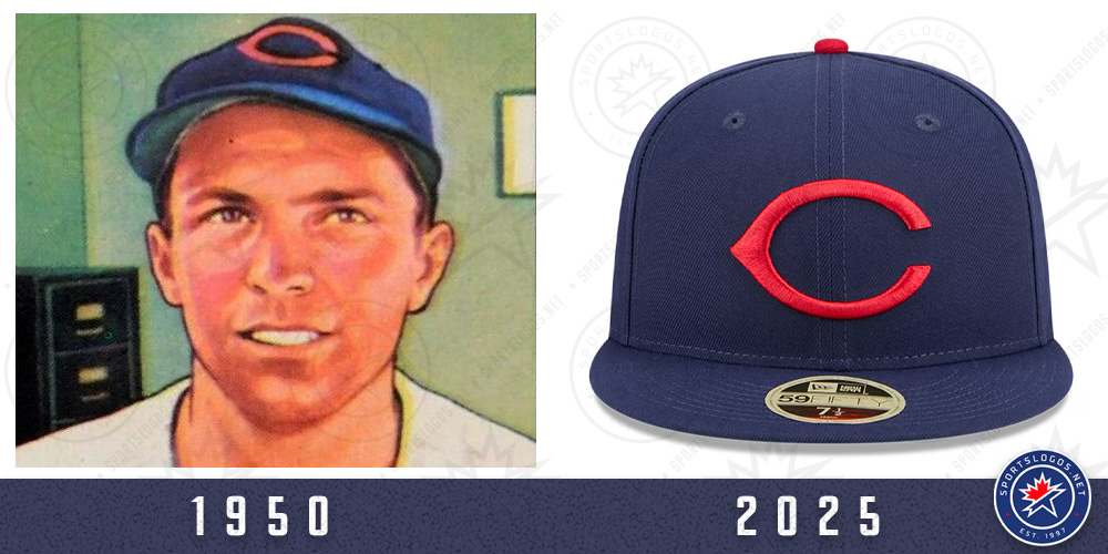
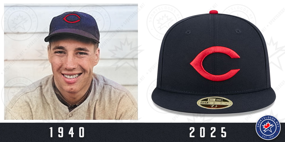
Cincinnati Reds
A navy blue cap with a red button and a wishbone-style red “C” logo, used from 1947–52. Slightly different shade of blue and shape of “C” that Cleveland is wearing.
Cleveland Guardians
Also a navy blue cap with red button and a red wishbone “C”, matching what the team (then Indians) wore from 1933–44.
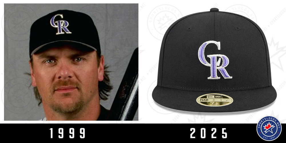
Colorado Rockies
Their standard all-black cap with purple-and-silver interlocking “CR” logo is the only primary cap in franchise history.
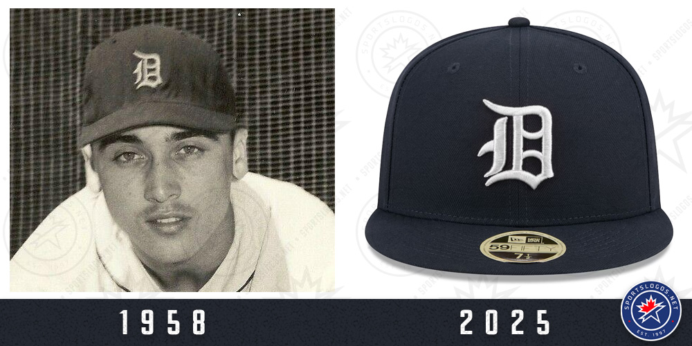
Detroit Tigers
A similar look to their usual home cap but with a more curved, wider “D” logo, matching the version worn from 1947–60.
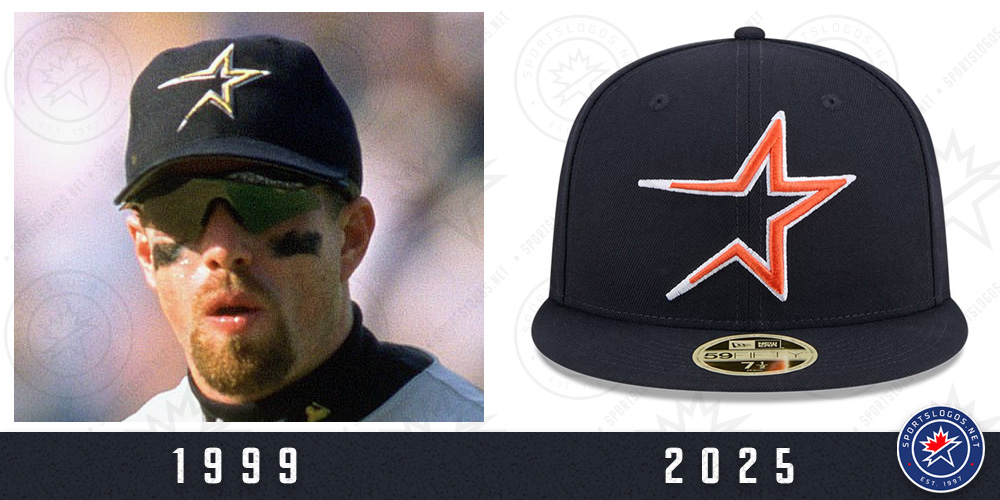
Houston Astros
The only club treating this like a “Reverse Retro”, the Astros are using their 1994–99 streaking star logo in orange on a navy blue cap, a recolour of their original gold-on-blue version.
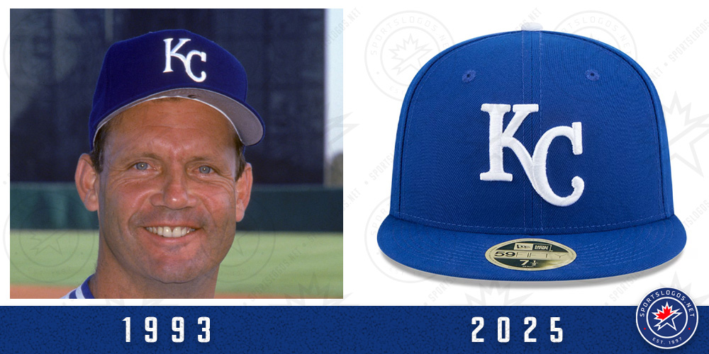
Kansas City Royals
The familiar royal blue crown with white “KC” logo and a white button, the team’s lone cap design since 1969.
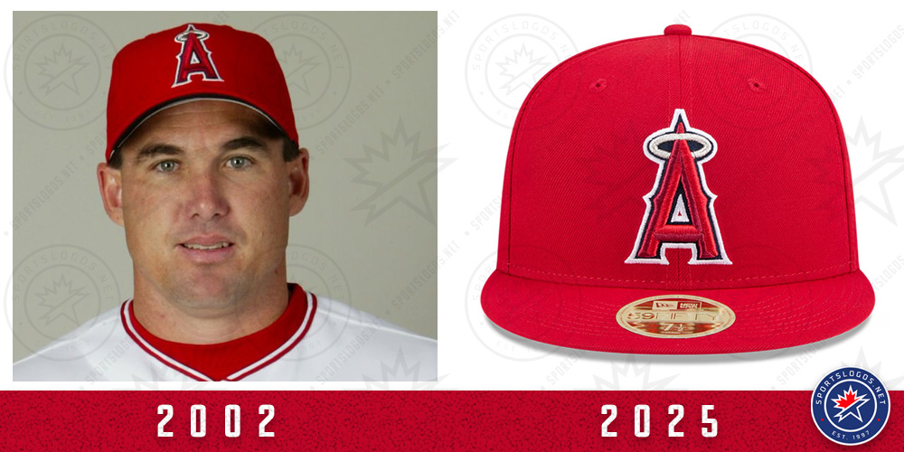
Los Angeles Angels
Wearing their standard red cap instead of the many other great options available. Presumably, they chose this to reflect the design worn during their only championship season in 2002.
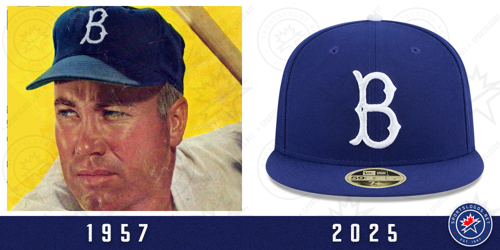
Los Angeles Dodgers
A Dodger blue cap with the Brooklyn Dodgers “B” logo, as worn from 1949–57, including their first championship in 1955.
SHOP: Get your retro-style 2025 Hall of Fame caps right now, they’re going fast!
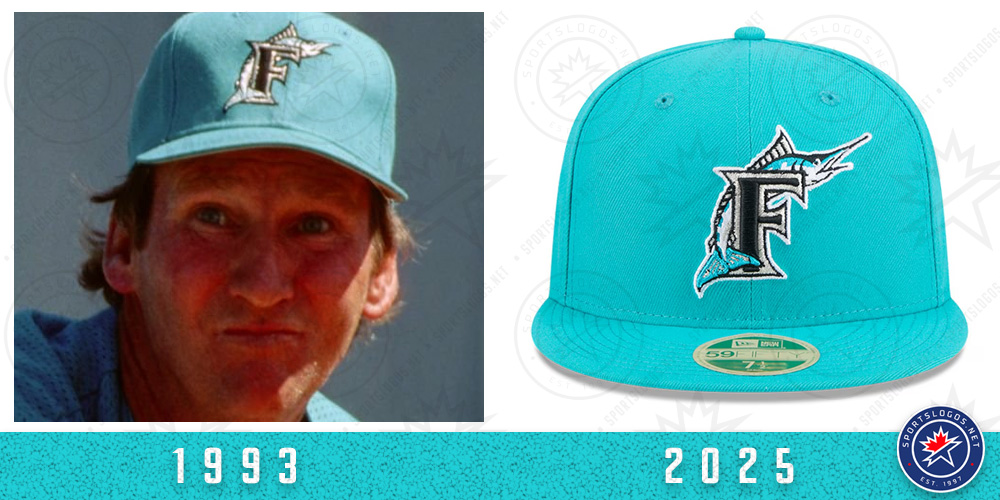
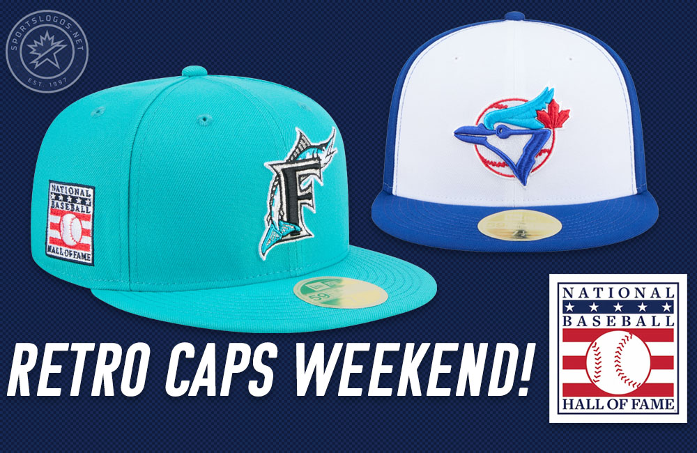
Miami Marlins
The fan-favourite all-teal cap with the original “F” and marlin logo from 1993–94, the first two years of the then-Florida Marlins.
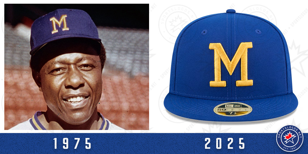
Milwaukee Brewers
Royal blue cap with a block yellow “M”, worn during the club’s first eight seasons in Milwaukee from 1970–77.
• Minnesota Twins: Blue crown and visor, red button, and a red “M”, matching the cap worn during the 1987 and 1991 World Series titles.
• New York Mets: Nearly identical to their usual cap, but with a wider “NY” and blue button, this version was worn from 1962–92, spanning both Mets championships.
• New York Yankees: A dark navy cap with a version of the interlocked “NY” that resembles the early 1910s and later the style worn in the 1940s and ’50s.
• Athletics: A Kelly green crown with gold visor, replicating the then-Oakland Athletics 1973–81 cap style, worn during two of their three consecutive championships from 1972–74.
• Philadelphia Phillies: Essentially their modern-day “Throwback Thursday” burgundy cap with the 1970–91-inspired “P” logo in white.
• Pittsburgh Pirates: Appears similar to their standard cap but features a larger keystone shape in the “P” logo, a nod to the version worn from 1948–70 — including the 1960 World Series.
• San Diego Padres: Brown crown with gold bell-shaped front panel and interlocked “SD” logo, worn from 1972–79 (this version lacks the orange outline the club wore from 1980-84).
• San Francisco Giants: A hybrid cap featuring the team’s primary logo from 1947–82 on a black crown, a design never actually worn before but allows a nod to both NYC and SF eras of the franchise.
• Seattle Mariners: Navy crown and teal visor with the compass rose logo, first worn from 1993–2003, revived in 2012. Possibly a tribute to the 2001 record-setting team or the ’95 ALCS squad.
• St. Louis Cardinals: Navy crown, red visor and button, with a front bird logo, a modernized attempt to echo the team’s 1942 cap worn during their World Series championship season.
• Tampa Bay Rays: All-black cap with the original 1998 “TB” Devil Rays logo, worn for the club’s first three seasons.
• Texas Rangers: All-blue cap with the wide white “T” logo first used from 1972–85. Historically, this was worn with a red visor and button, but not this time.
• Toronto Blue Jays: White front panel with original team logo and blue crown, the version of this logo (with a more turquoise-like blue on the logo) was worn from 1989–93 (including both World Series winning seasons), revived briefly as an alternate in the late 2000s.
• Washington Nationals: A “DC” logo cap originally worn from 2006–08, now placed on a navy crown with red visor and button. An Expos tribute was not in the cards.
Here’s a look at all 30 Hall of Fame Weekend cap designs for July 25-27, 2025:
All 30 Hall of Fame Weekend retro team caps are now available through MLBShop and Fanatics.