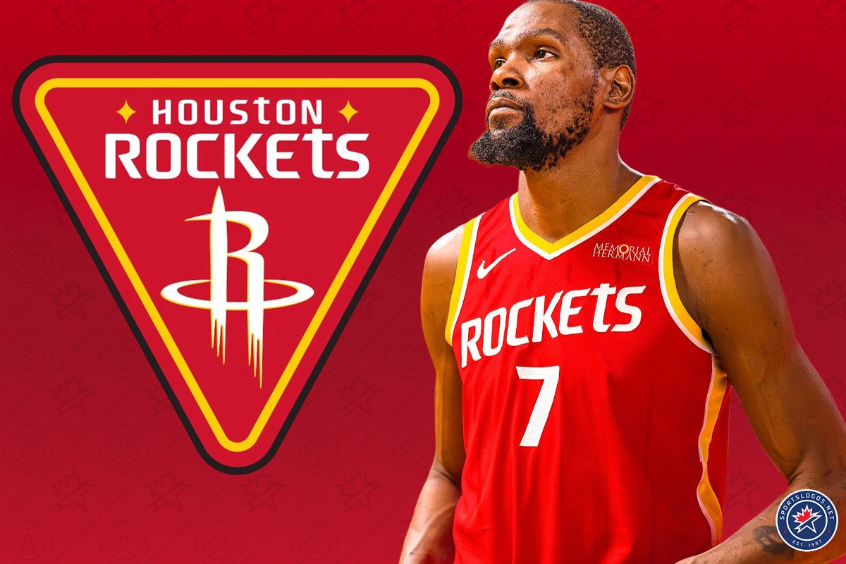

The Houston Rockets blasted off early this morning by unveiling the team’s new logos, new uniforms, and new colour scheme – a return to the red and yellow that had been used for the team’s first two decades in Houston.
The four logos unveiled today continue to feature the R/Rocket ship lockup that has been used in various forms since 2003, but now recoloured in that new red and yellow rather than red and silver. One logo features that “R” on a space mission-style triangle patch, another places the logo in yellow on the back of a basketball-dunking astronaut (which had been used previously on their “H-town” City Edition uniform from 2023-24), and another simply swaps the silver drop shadow for yellow on the “R” logo itself.

As for the uniforms, we’re getting a red “Icon,” white “Association,” and black “Statement” edition set, all featuring the new logos and colour scheme and all combining elements of the Rockets’ looks that, I presume, tested most positively amongst the focus groups (i.e., no late-90s rocket face).
Here’s the uniform unveiling video posted by the team:
Breaking down the uniforms before we get into the logos…
The new Association Edition uniform (what we would’ve called “Home Uniform” in the beforetimes) is white with red and yellow stripes down the side, red and yellow trim around the collar and arms, and a single-colour red “HOUStON” wordmark, diagonal across the chest and number below, similar in style to the jersey wordmark of the 70s-90s. Subtle silver pinstripes are worked into the background of this jersey, which, I guess, is a shoutout to the late-90s rocket-face set after all (hey, I stand corrected!).

The jock tag includes the phrase “CLUTCH CITY,” in red, flanked by two yellow diamond stars. The “Dunkstronaut” logo is on the waistband of the shorts.
As for the new “Icon Edition” uniform (nee “Road Uniform”), it’s a faithful flip in colours of the white set. A red base with white/yellow trim, dark red pinstripes subtly worked into the background, and now “ROCKEtS” diagonally across the chest in single-colour white.

The shorts for both these uniforms have the rocket blast-off inspired design on the side with the “R” logo inside.
Finally, the black “Statement Edition” (i.e., “alternate”) changes things up a bit. Single red striping around the collar, and top of the sleeves (not front or back, just… top), across the chest is “HOUStON” red diagonal lettering with the player number below in white. Pinstripes are replaced by a shooting star style design throughout the base of the uniform.

The back of the uniform has the player’s name in red, arched above their number in white with a red stripe vertically coming up from the bottom with a subtle “R” logo at the top of it. Shorts are black with the “R” logo on the side in red and yellow.
Here’s the logo unveiling video from the Rockets, which runs through the primary logo history of the club, including their time in San Diego:
Taking a look now at each of the new logos, starting with the new “Global Logo,” which we here at SportsLogos.Net will use as the primary brand for the club.
GLOBAL LOGO
The logo features the club’s new wordmark in white at the top of a red triangle trimmed in yellow and black. Below the wordmark is the usual “R/Rocket Ship” logo, again, now with yellow features instead of silver. Two yellow diamond-shaped stars are placed next to “Houston” in the wordmark.
The Rockets say this logo is inspired by space mission patches, with the two “quasars” (I presume this is what a mere layman such as myself calls “diamond stars”) symbolizing the franchise’s two homes in San Diego and Houston.
PRIMARY ICON
The “Primary Icon” logo remains “at the core of the franchise identity,” says the club. The R/Rocket Ship design has been used by the team since the 2003/04 season, meaning it’s been around just as long as that red/yellow basketball mark the club wore for their two NBA titles in the mid-90s. The Rockets remind us that this logo “symbolizes two rockets launching through a Saturn-inspired basketball hoop.”
SECONDARY LOGO
The infinitely popular “Dunkstronaut” logo is now an official part of the club’s permanent logo set. This logo, featuring an astronaut in full gear dunking a basketball, first appeared on the club’s City Edition set in 2023-24. Note a couple of “hidden” elements here: the basketball in the shape of a crescent moon, the two diamond-stars on the face shield, and an “H” worked into the side of the helmet. Very good.
WORDMARK LOGOS

As for wordmark logos, they’re bringing back the random lowercase lettering that was a part of the club’s look from the 1970s through 1990s, this time just with the “T” across the board. The Rockets call it a modernization of their championship era typography with a “futuristic edge.”
We’ll be updating with more details and photos on this new set as they become available.
The Rockets won’t be the only team to unveil new logos and/or uniforms this offseason, as the Minnesota Timberwolves will do so on June 7, while the Atlanta Hawks are expected to follow suit before the 2026 NBA Draft in late June.
Of course, we have already seen the Timberwolves’ new look after their official team website accidentally leaked their promo photos last weekend. The Hawks, on the other hand, have not even acknowledged that any changes are on the horizon.