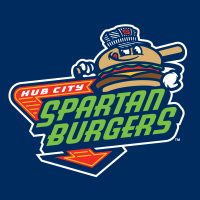

The newest entry in the world of Minor League Baseball branding is the Hub City Spartanburgers, just unveiled yesterday. The Single-A affiliate of the Texas Rangers, newly relocated from Kinston, North Carolina, will play in Spartanburg, South Carolina. The town of Spartanburg earned the nickname Hub City because historically, it has been a hub of commerce and industry, and more specifically because it played host to seven rail lines that radiated from the city like spokes on a wheel.


The team is reviving the nickname of a one-year wonder, a collegiate summer level franchise simply called the Spartanburgers, who played in the Coastal Plain League in 2021.


The logo for the new Spartanburgers team, created by Dan Simon of Studio Simon, is highlighted by an as-yet unnamed hamburger character, as well as an anthropomorphized pickle slice and spatula, named Chip and Flip respectively. The name Spartanburgers is one word, despite the fact that it’s broken up and stacked in the primary logo.


As with many employees of Minor League Baseball teams, the burger character wears many hats. In different versions of the logo, he’s wearing an engineer cap, an homage to the railroad industry; a cowboy hat, a tribute to the team’s parent club; and a baseball cap, because that’s what it’s all about.


Neon arrows and the typographic stylings of the brand reference signage from establishments where one might find a hamburger—or even a Spartanburger.
“Burger joints, diners, and drive-ins are famous for their hamburgers, like the Beacon Drive-in in Spartanburg,” Simon said, referencing an iconic local restaurant. “The typography was meant to evoke the distinctive elements of the signs you see at those eating establishments.”


A Hub City script is underscored by the rail of a railroad track, with an engineers cap resting on the C of City.


One unusual element about this brand, especially one that comes from Studio Simon, is that it features a lot of different colors. The decision to go with a six-color logo was a matter of taste, as it were.
“We had a conversation about, could we exceed the four-color unwritten rule of thumb,” Simon said. “Every time we took out the lettuce, tomato, cheese, or another color for the bun, it felt incomplete. We came to the conclusion that it looked best, like it tasted better, if we included lettuce, tomato, and cheese. We decided, damn the tomatoes….”


When the Carolina League’s Down East Wood Ducks relocate to Spartanburg for the 2025 season, they’ll be the first affiliated Minor League Baseball team to play there in three decades.


