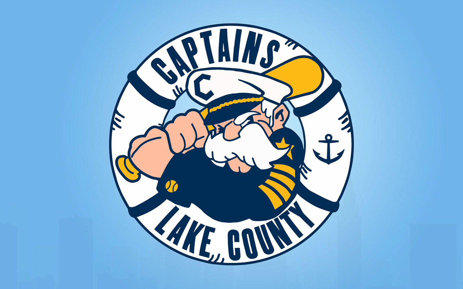
The High-A Lake County Captains unveiled a new identity today that draws heavily on their own past as well as that of their parent club, the Cleveland Guardians, who play just 17 miles away. The new brand, designed by Kevin McLaughlin, expands on previous marks from the franchise’s past and adds a series of new ones.
“First and foremost,” the team said in a statement, “we envisioned a logo wordmark that draws inspiration from our remarkable 33-year history in Lake County and Georgia. We wanted an emblem [to] possess the flexibility to stand alone or seamlessly integrate with the ‘Lake County Captains’ text.”


The new marks center around an updated, forward-facing captain character, whose mustache has grown to near Sam Elliott proportions. The captain is wearing new baseball cuff links and a hat that is branded with a C from the new suite of logos.


Speaking of that new C…


The team’s new wordmark and their C cap logo are inspired by the “Caveman” font used by the Cleveland Indians from 1973 to 1997. The C logo features an anchor that has been found in previous iterations of the team’s brand.


Another new wordmark that uses an updated anchor design as the letter C, the team is embracing a nickname that fans have used all along, the “Caps.” The wordmark makes use of a longstanding tradition in baseball branding, incorporating a ball into the letter P.


While the team’s new suite of logos features a simplified color palette, most notably eliminating the red that has been seen in some marks. That red is used in two of the four uniforms in the team’s new set, including the away uniforms and one of two alternates.
For further explication, the team provided the following:


The new-look Captains will take the field in April 2025 when High-A Midwest League play begins.

