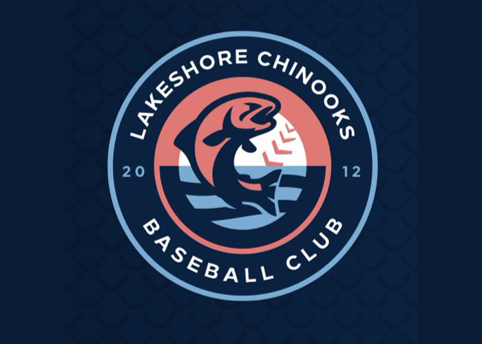
The collegiate summer level Lakeshore Chinooks unveiled an identity the team is calling “Nook Nation.” The identity will augment the team’s traditional look and will serve as an occasion City Connect-style brand.


The team released a branding guide to explain the colors (the namesake fish and a summer sunrise over Lake Michigan), primary mark (an aggressive fish defending its territory) and ancillary elements (baseball stitches that look like seagulls, Milwaukee’s “People’s Flag,” and the year of the team’s founding).
The new brand has been a long time coming.
“The Nook Nation alternate brand has been years in the making,” Chinooks GM Eric Snodgrass said in a statement. “We wanted an alternate and fresh look that we could use on occasions through the off-season and during the summer while still keeping our classic branding as our primary look. From the different unique elements in the logos to the new color palette, we think the new brand will be a great representation of our fan base in the Northshore and the Milwaukee metro area.”


Per the team, the Chinooks fanbase has called itself by the nickname Nook Nation since 2013.


The fish in the logo is an updated version of the chinook (a kind of salmon) reflected in the team’s original logo.
The Nook Nation brand will be seen on the fields of Northwoods League teams across the upper midwest beginning in May 2025.


