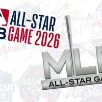

Standardized sports logos are trending, from the Super Bowl to literally everything in the NBA. But what about Major League Baseball’s All-Star Game…
Well, guess what? It looks like baseball’s annual Mid-Summer Classic is ready to join the club.
“You might start to see some similarities in the format and structure of the ASG logo from year to year,” MLB Senior Creative Director Jason Yeadon told SportsLogos.Net in an email over the weekend.
Gulp. That sure is a fancy way to say we’re going to use the same logo every year.
But, hold on, it couldn’t possibly be at the level of ridiculousness that was the logos for Super Bowls XLV through XLIX… Right?
The MLB All-Star Game is one of the few remaining annual sporting events to create a completely unique, distinct logo each year to great appreciation from its fans. In fact, after I posted an MLB All-Star Game logo history graphic to Twitter earlier today, a bunch of the replies simply pointed out how great it was they still came up with something new every year (I didn’t have the heart to tell them).
While Yeadon’s comment sends a shiver down my logo-loving spine, there was a promising nugget of hope yet to come.
“It is a careful balance and fun one, looking at the mission and making a logo that has consistency with a distinct personality annually,” Yeadon added.
Those last four words, “a distinct personality annually,” are crucial. This shows a clear realization and recognition of what a logo for any event (with a pre-determined carousel of hosts) must have.


It’d be difficult to argue that the standardized Super Bowl logos and NBA All-Star logos have been anything but a disaster. Both leagues took events that each have a “distinct personality annually” (or, at least, they used to) and locked their visuals into a figurative prison cell devoid of all creativity. Events played in a different city every year hosted by a different team, each one filled with opportunities aplenty to pay tribute to a new market and their respective, unique fanbases… the response from the league should never be, “Well, you’re all the same to us,” but the visuals say otherwise.
The next MLB All-Star Game logo will likely be released next July for the 2026 game in Philadelphia. Could this be where we see the new system in place? Or has the system started, and we have yet to realize it? Maybe the slanted star from the new 2025 MLB All-Star Game logo is one piece that gets pushed over from year to year? It seems plausible. As far as I can tell, there’s no connection between that specific star style and Atlanta or the Braves.


Based on Yeadon’s comment, I hope that Major League Baseball is simply choosing a single, relatively small element to carry over from year to year and then customizing everything around it to give it its own life, unique to each host. Maybe “All-Star Game” will be presented in the same typeface each year? If a standardized template-style logo must be used, this is 100% the way to do it.
Successfully standardizing elements year after year has been done before, and quite well. The Canadian Football League, with its Grey Cup logos, pulled this off very effectively for many years in the early part of the 2000s. The NHL Draft logos also nailed this. Both of these events are played in a different city with a different host team every year, just like the MLB All-Star Game, and yet they were able to give each game its own distinct visual identity.
“But the Grey Cup and NHL Draft made a whole new logo every year!” you may be shouting at your ad-filled mobile screen.
“Exactly!” is my obnoxious response.
Most fans never noticed these events ran with a standardized logo system because it was done well. I’m hoping those in charge of making such decisions at Major League Baseball take a look at these two very successful examples. I hope they recognize what aspects of it worked (*cough* each logo had a vastly different overall shape), why they worked so well (*cough* they were completely re-coloured to pair up with each host, and *cough* the main surrounding elements were designed to do the same), and then emulate those ideas when developing their own designs. Excuse me.
Look, if a standardized logo system *has* to happen, this is how you do it. It’s a compromise between the corporate creative sterilization that pro sports leagues are hooked on and the “hey, can’t we get something unique that represents us?” that the fans and consumers in each hosting team’s market crave.
I’ve got my fingers crossed.


