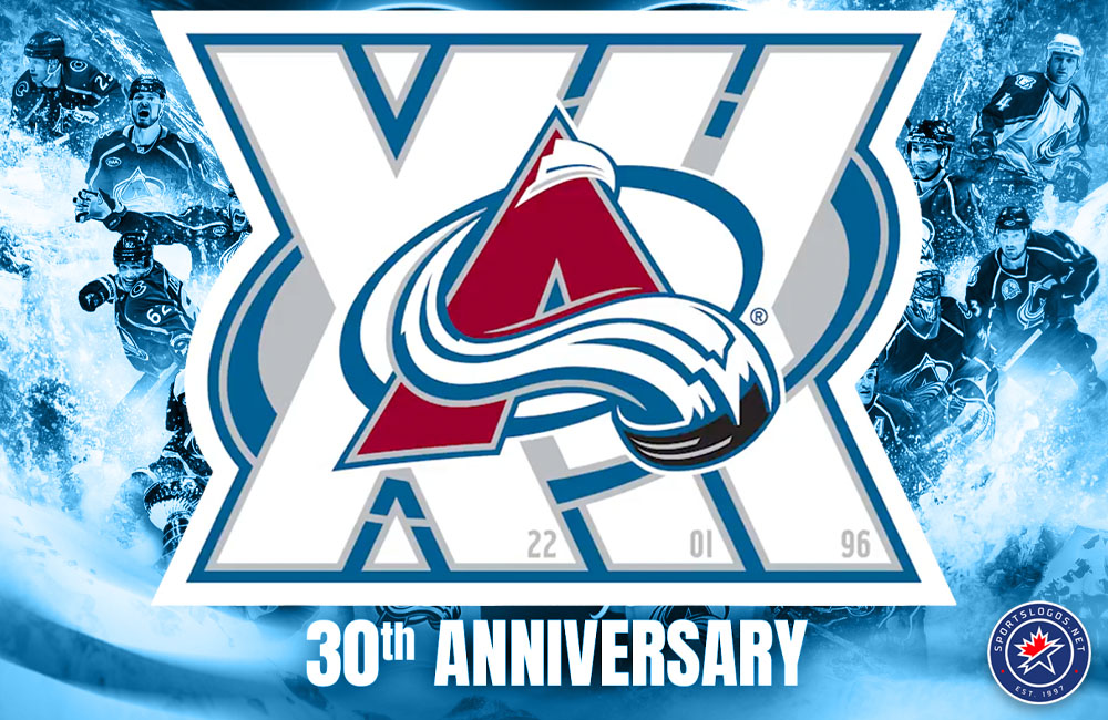
Three decades of NHL hockey in the Rockies will be celebrated this season in Denver.
This week, the Colorado Avalanche announced plans to mark the franchise’s 30th anniversary since moving to Denver, with the reveal being made thirty years to the day that the club first unveiled its Avalanche name and logo in 1995.
The part of the announcement we were most interested in, of course, was their new 30th anniversary logo, which is centred around three horizontally stacked Roman numeral Xs in white, with the years of the Avs’ three Stanley Cup championships (96, 01, 22) embedded, subtly, into the bottom. The Colorado Avalanche logo is placed upon the design.
The Avalanche said this new 30th anniversary logo will appear at centre ice at Ball Arena throughout the season, as well as a decal on the back of every player’s helmet. Additional details surrounding this special season are yet to come.
Colorado’s franchise history begins in Québec, where the then-Nordiques débuted in the World Hockey Association back in 1972, winning one league championship in 1977, before joining the NHL in 1979 along with three other WHA teams. Following the 1994-95 lockout-shortened season (and a first-place finish in the Eastern Conference), the Nordiques moved to Denver, bringing the NHL back to Colorado following the failure of the old Rockies, who moved to New Jersey in 1982. The Avalanche won the Stanley Cup in their very first season in Colorado in 1995-96, then again in 2000-01 and 2021-22.
No plans for a special jersey were announced by the Avs, but other recent NHL anniversary seasons could offer a playbook for what might follow. Both the Boston Bruins and Chicago Blackhawks developed special 100th anniversary sweaters, younger teams such as the Anaheim Ducks and San Jose Sharks used their own 30th anniversaries to lean on uniforms inspired by their early seasons. Looking at another team which relocated in the ’90s, the Carolina Hurricanes have revisited their Hartford Whalers origins several times in recent years.
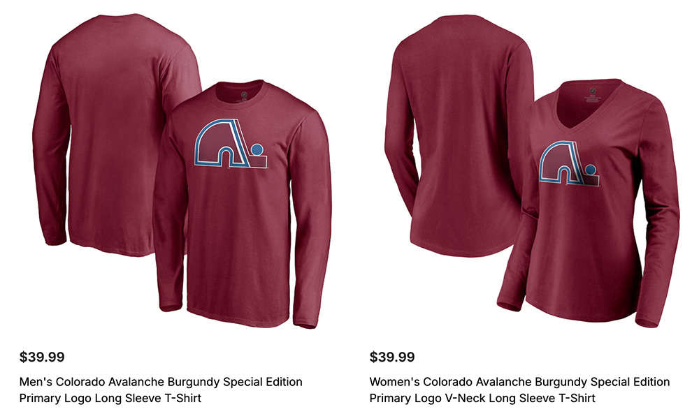
For Colorado, the possibilities could include bringing back an old team uniform, perhaps one of their discarded alternate sweaters or Reverse Retro designs. Of course, it’d be hard to ignore the possibility of a Québec Nordiques uniform tribute, which, like the Hurricanes and their Whalers tributes, would cause some mixed emotions around the hockey world. The Avalanche previously tested that ground with Nordiques-inspired Reverse Retro uniforms earlier this decade, which were recoloured to match the modern Avs palette. I raised my eyebrow a bit when I noticed the team’s online shop recently listed a couple of Nordiques items with the title “special edition primary logo.” Hmm…
Colorado joins the Chicago Blackhawks (100), Columbus Blue Jackets (25), Detroit Red Wings (100), New York Rangers (100), and Winnipeg Jets (15) as NHL clubs that have unveiled commemorative anniversary logos for the upcoming 2025-26 season.
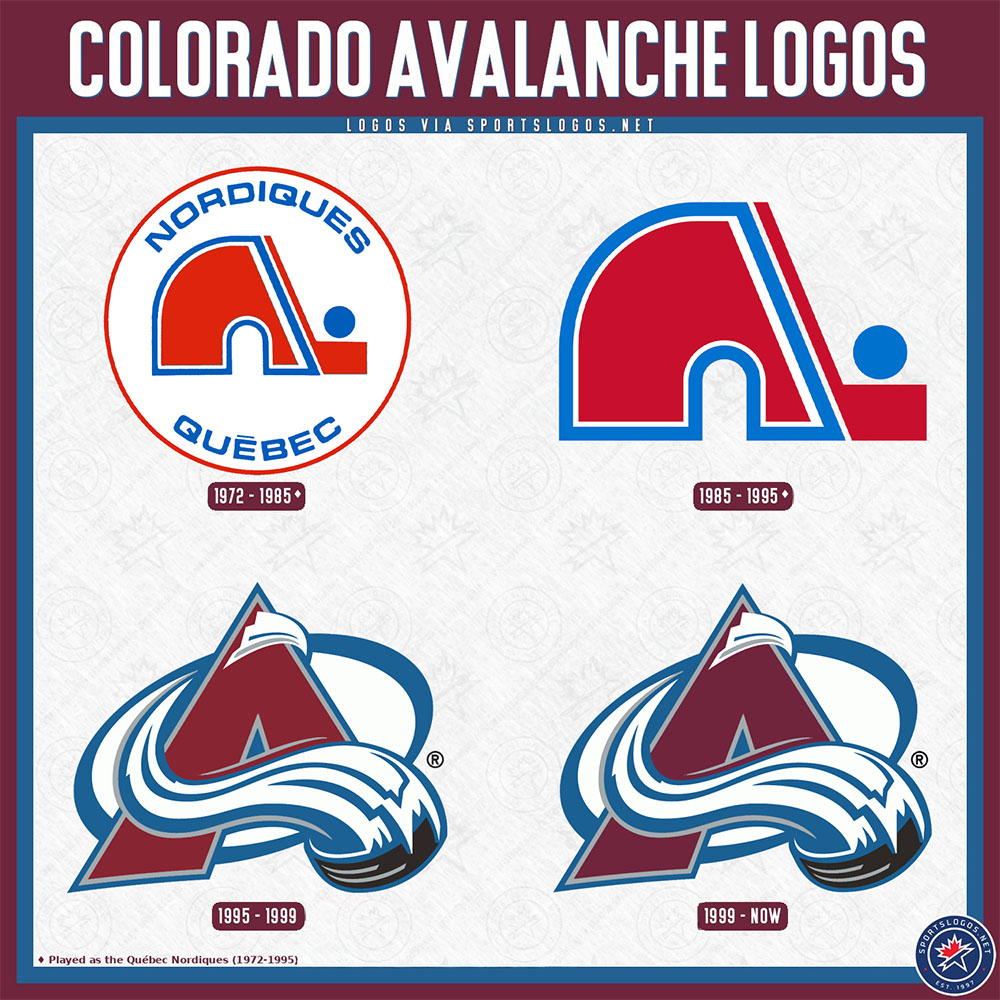
QUEBEC NORDIQUES – COLORADO AVALANCHE LOGO HISTORY
The Québec Nordiques logo is a stylized lowercase “N” in red with white and blue trim, and a hockey stick placed next to the logo with a blue puck on the top. It has been said by many that the logo was designed to resemble an igloo (which would make sense, as the name translates in English to “Nordic”); however, this fact has not been confirmed.
The Nordiques used their lowercase “N” logo throughout the club’s history in Québec City with only a moderate adjustment in their primary, removing a circle and the team name around it to match their on-ice sweater logo, for the 1985-86 season. The logo was originally designed in 1972 to feature an all-blue colour scheme, with varying shades throughout, but this plan was rejected by the club’s owners to reflect a more familiar red, white, and blue look, perhaps to match the look of the nearby, and long-established Montréal Canadiens.
Shortly before their relocation, the Nordiques announced a drastic rebranding, featuring a purple, teal, and silver uniform with a husky as the main element on the chest. The plan was to wear this uniform for the 1996-97 season, but, of course, the club moved to Denver more than a year before that could happen.
While the new Colorado club was working on its branding in the Summer of 1995, rumours swirled suggesting the team would be known as the Rocky Mountain Xtreme, which may seem silly to younger readers, but rest assured… it seemed just as silly to us back then. Backlash led to the team publicly denying this report before the new Colorado Avalanche logo and name were unveiled on August 10, 1995. Like the Nordiques, the original logo was in another colour set, one heavy on forest green, before a printer ink error produced a look closer to what the club uses today and turned the team’s new colour scheme into a new direction.


