The Florida (ah, shoot…) MIAMI Marlins teased the unveiling of a new “Sunday Alt.” uniform yesterday, via a social media post pointing to a reveal at their FanFest on February 7.
The post showed two cubbies, one with the club’s usual primary cap and one with their “305” City Connect cap, before cutting to a third empty one, quickly filled with a note card reading “SUNDAY ALT.” The post was captioned with two dates, 02072026 and 03292026, which appear to point to this uniform’s unveiling date (February 7) and on-field debut (March 29 vs. Colorado).
A click through to the URL shown in the post takes one to a teal-clad website designed to resemble the old outfield “Teal Monster” scoreboard at Joe Robbie Stadium, the Marlins’ original home ballpark, along with a form to “be the first to find out.” The scoreboard again shows the same two dates, along with an analog clock showing the time 2:07, matching the February 7 expected unveiling date.
For now, this is still just a teaser. The team hasn’t shown the uniform itself yet, but between the dates, the “Sunday Alt.” note, and the themed landing page, it certainly feels like we’re being led toward a teal-heavy reveal next month.
The teaser comes two weeks after an apparent leak-in-plain-sight we saw leading up to the NHL’s Winter Classic, held at the Marlins current home ballpark on January 2. This involved a video posted to the league’s Instagram account that featured a rollerblading street hockey player wearing a design very close to the old Florida Marlins teal batting practice jersey, complete with the scripted “Marlins” wordmark, but on the modern Nike template and with much thinner sleeve stripes. That made it less likely this was simply a for-retail-only Cooperstown Collection top. The jersey in the video also included the original Florida Marlins logo as a sleeve patch.

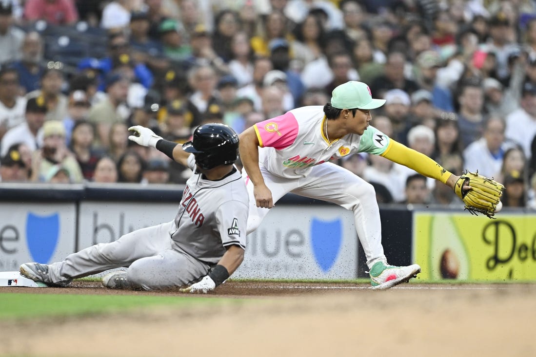
Suppose this is indeed a new alternate uniform for the Marlins. First of all, awesome. A club with this identity and playing in this market has leaned far too hard into a black and grey look since their 2019 rebrand. Last year’s addition of the vibrant pink-and-teal City Connect 2.0 set and a bright blue version of their black alternate jersey certainly helped, but a proper teal return would push the whole Marlins look up another level.
As far as what’s still up in the air: if this is a new alternate uniform, which uniform is getting the axe? Is it the suddenly somewhat redundant blue alternate? Or maybe they join the growing group of teams to completely ditch a road grey jersey? Also, what cap’s being paired with it? Is it the original 1993 Florida Marlins cap? Is it teal or black? Does it still have an “F” on the logo even though they’re no longer called “Florida”? How about the patch on the sleeve? Does the logo say “Miami” now?
Those are all enough to give me reason to tune in to the announcement next month.
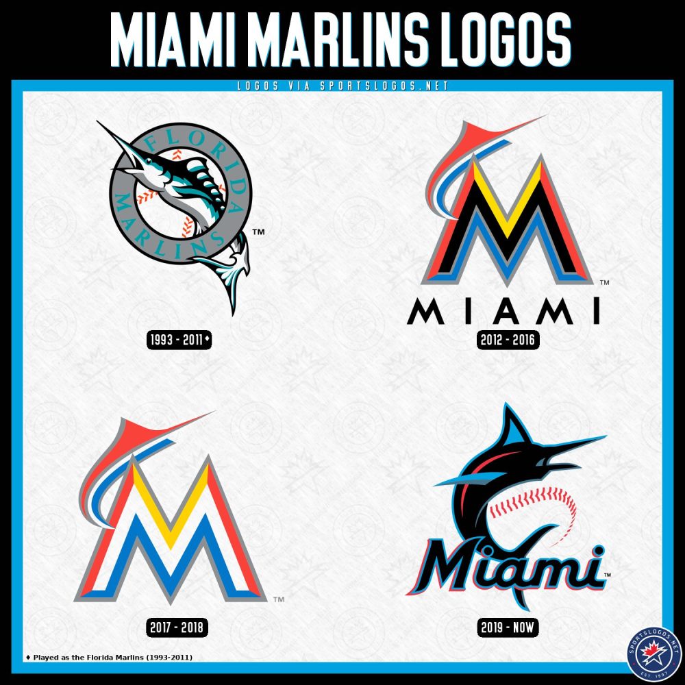
The Marlins joined the National League as an expansion team in 1993, along with the Colorado Rockies. Their first uniform set was teal-heavy and included one option featuring a teal-pinstriped white vest with teal sleeves and a teal cap. As the colour fell out of style, the Marlins moved more towards black and silver, having solidly embraced those as their primary colours during their World Series victories in 1997 and 2003. In 2012, along with a move to a fancy new stadium, the team swapped out the Florida in their name for Miami, and introduced orange as their new primary colour. Again, the team quickly drifted back towards black as their primary colour before yet another total rebrand in 2019 made it the centrepiece.
Miami joins the Brewers and Athletics as clubs to announce a uniform change for the 2026 season. The Brewers introduced a new powder blue road uniform with “MILWAUKEE” arched across the front, and the don’t-call-us-Sacramento Athletics added a “Sacramento” scripted wordmark to their yellow alternate jersey.