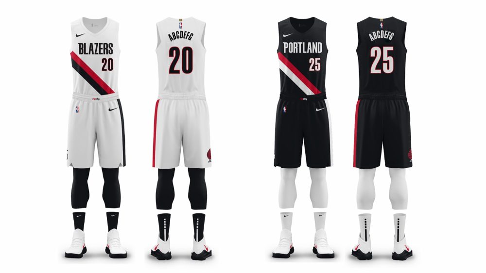
The Portland Trail Blazers revealed subtle updates to their Association and Icon Edition uniforms on Tuesday, most notably removing silver from their iconic sash to create a more streamlined design.
The sash, which has been a staple on Portland’s primary uniforms since the 1977-78 season, originally featured a two-color design until the Blazers added silver accents in 2002-03 to match an updated version of their pinwheel logo.
The Blazers began stripping away some of the overdesigned aspects of their branding when Nike took over as the official manufacturer of the NBA in 2017-18, though, as they introduced a cleaner logo and new wordmarks that lacked silver accents.
This year’s update finishes that process, as Portland also dropped the silver and red trim from the collar and arm holes on the jerseys. The uniforms are complete with the aforementioned pinwheel logo on the shorts and “Rip City” on the waistband.
The pinwheel logo has been on the right leg of the asymmetrical shorts, which include a continuation of the sash down the left leg, since 1977-78, while “Rip City” was added to the waistband with the unveiling of their previous uniforms in 2017-18.

The Blazers’ updated Association and Icon Edition uniforms will be joined in the wardrobe by their red Statement Edition set, which was introduced in 2022-23, as well as a new City Edition design, which will reportedly be a recolor of a previous year’s look.
Portland becomes the third team to refresh its primary look this offseason, joining the Orlando Magic – who revealed new uniforms, logos and court design in June – and the Utah Jazz, who actually announced their changes last summer as part of a two-season rollout.


Photos courtesy of @trailblazers on X/Twitter.


