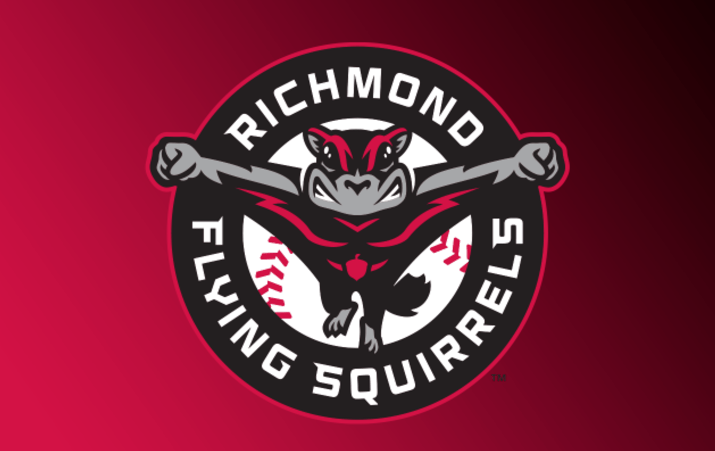

When the Double-A Richmond Flying Squirrels move in to their long-awaited new ballpark in 2026, they’ll take the field in duds that offer a fresh take on their familiar brand. The overall feel of the team’s identity first seen in 2008 remains intact, with a superhero flying squirrel set in red, black, and white. But Nutzy, who was sailing peacefully in that original brand, now has clenched fists and is set in a more aggressive stance that the team calls a “Blastoff Pose.”
The suite of logos, created by Brandiose, the firm responsible for the team’s original identity, features Nutzy in a number of superhero poses, including various forms of flying and one stance that looks like a Marvel character who has just landed in a crouch after a long jump.
“We take a lot of pride representing Richmond,” said Flying Squirrels General Manager Anthony Oppermann in a statement. “The Flying Squirrels brand has become part of the city’s identity. It is important to us to maintain that identity as we enter our next chapter at CarMax Park. This dynamic new series of logos and wordmarks modernizes our brand set and introduces more versatility to our on-field look while also remaining true to who we are and who we represent.”
The team unveiled four uniform sets with the logos:
The home whites feature what the team calls its “Squirrelly Script,” paired with a front-facing flying Nutzy cap.
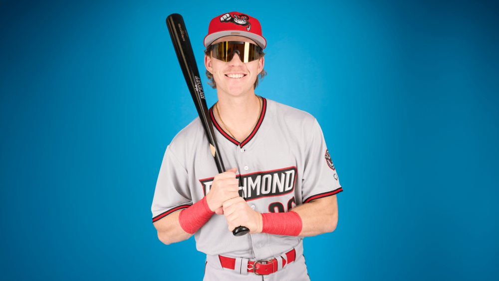
Road greys have an updated “Flight Font,” which the team will wear with red caps and a fist-forward flying Nutzy.
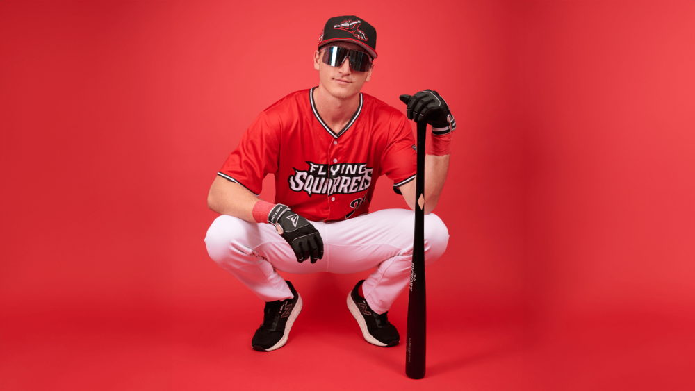
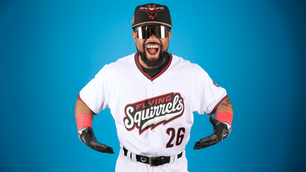
The Squirrels will wear alternate red jerseys with a two-toned black and red cap that features a three-quarter angle flying Nutzy—the logo that most closely resembles their previous logo.
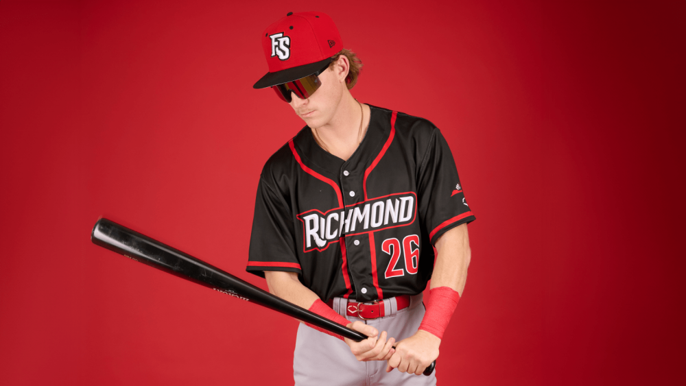
And finally, black alternate road jerseys will be paired with a red and black FS cap.
The Flying Squirrels, an affiliate of the San Francisco Giants, will debut their new look in April when the Eastern League 2026 season gets underway.