Fundamental
Overview
Yesterday, the Fed finally started its easing cycle and decided to do it with a 50 bps
cut. The market was already leaning towards a 50 bps move, so it wasn’t a
surprise.
The larger cut was framed
as kind of an “insurance” cut with the dot plot showing two more 25 bps cuts by
the end of the year and less than the market expected in 2025.
What’s important is that
the Fed is cutting into a resilient economy which should lead to better growth
expectations and support the stock market.
S&P 500
Technical Analysis – Daily Timeframe
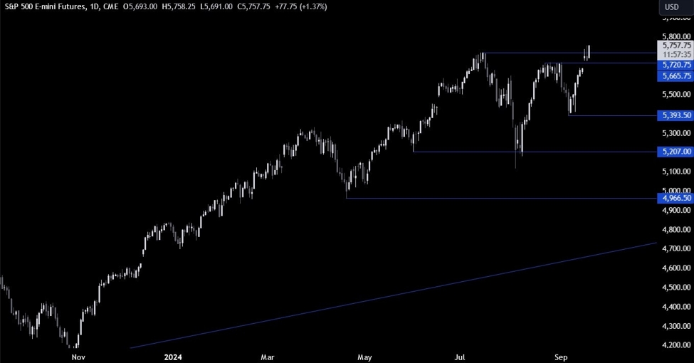
S&P 500 Daily
On the daily chart, we can
see that the S&P 500 after some short-term noise after the FOMC decision,
rallied to a new all-time high. The buyers will now keep on buying the dips as
long as the data continues to remain benign or, even better, improves.
This is
not a market for the sellers, so they might want to wait for key breaks on the
lower timeframes or better yet for recessionary catalysts before piling in.
S&P 500 Technical
Analysis – 4 hour Timeframe
S&P 500 4 hour
On the 4 hour chart, we can
see that we have an upward trendline
defining the current bullish momentum. We can expect the buyers to keep leaning
on the trendline to position for new highs, while the sellers will look for a
break lower to pile in for more downside.
S&P 500 Technical
Analysis – 1 hour Timeframe
S&P 500 1 hour
On the 1 hour chart, we can
see more clearly the recent price action with the whipsaw on the Fed’s decision
and then the rally overnight. There’s not much else we can glean from this
timeframe as the buyers will look to buy the dips, while the sellers will wait
for a bearish catalyst or a break below the trendline. The red lines define the
average daily range for today.
Upcoming
Catalysts
Today we get the latest US Jobless Claims figures which is the last important
economic release of the week.


