
The Minnesota Timberwolves are set to officially unveil their new uniforms at 5 p.m. ET on Sunday, though their white Association, royal blue Icon and black Statement Edition designs were already leaked by the team’s website.
All three uniforms feature a “Wolves” wordmark across the chest, similar to their 1989-96 design, while the Statement set includes tree trim along the collar, arm holes, waistband and bottom of the shorts that mimics their 1996-2008 look.

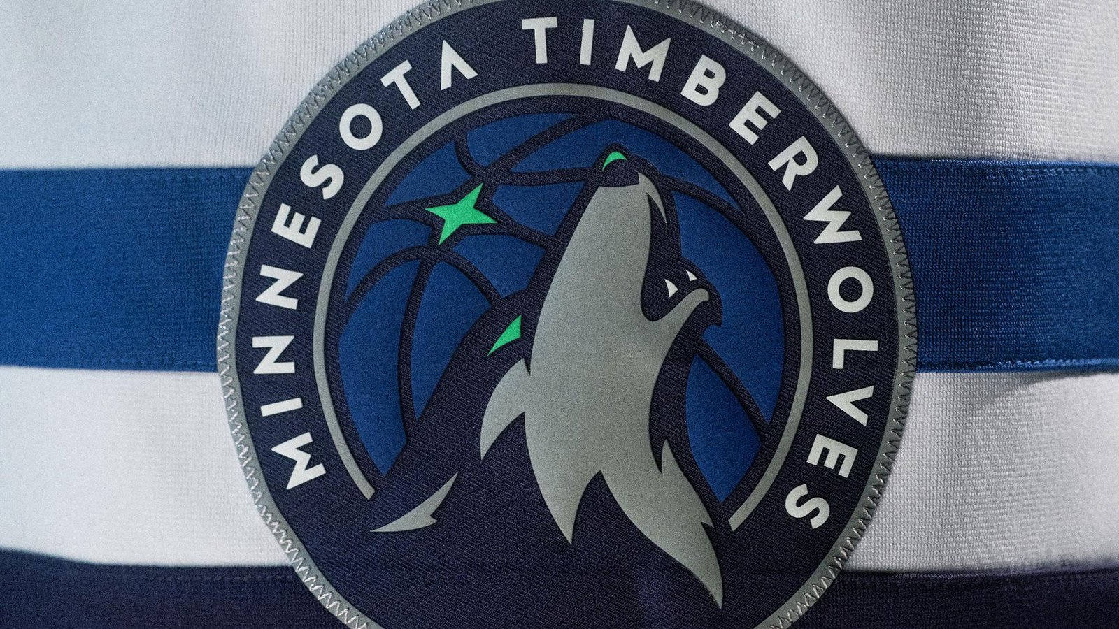
The uniforms also include their new primary logo on the shorts, which combines their original color scheme with elements from their 2008-07 secondary and 2017-26 primary logos that both feature a howling wolf inside of a basketball.
With that said, we’ve decided to take a look back at the Timberwolves logo and uniform history, which dates back to the 1989-90 season when they and the Orlando Magic joined the NBA as expansion franchises.

It was the first time since the Minneapolis Lakers departed for Los Angeles in 1960 that the Twin Cities had an NBA team, though the Minnesota Muskies (1967-68) and Minnesota Pipers (1968-69) notably played in the ABA.
The Timberwolves wore white uniforms at home and royal blue uniforms on the road, both of which featured a “Wolves” wordmark across the chest, a traditional striping pattern for trim and their original logo on both sides of the shorts.

The logo, affectionally known as “Old Shep,” was designed by Iowa resident Mark Thompson, who won $2,500 from the team’s create-a-logo contest by reusing a concept he created for the USHL’s North Iowa Huskies in 1982.
“Old Shep” featured a royal blue and white wolf with green eyes in front of a silver basketball, which would ultimately be the inspiration for the 2008-17 alternate logo and 2017-26 primary mark, which we’ll discuss further in a minute.

This look would remain until the 1996-97 season, when Minnesota unveiled a menacing logo that featured a wolf emerging above pine trees that would also serve as the trim on their white home and slate blue road designs.
The logo’s jagged wordmark, as well as its black and silver accents, were a prominent part of the Timberwolves’ new uniforms, which led them to introduce the first black alternate uniform in franchise history ahead of the 1997-98 campaign.

The wolf’s head appeared on the right leg of all three uniforms, while an interlocking “MT” that was stylized to also look like a wolf’s head – with ears and fur protruding – was on the left leg of the asymmetrical shorts.
In 2008-09, the Timberwolves simplified their wordmark and the trees in their logo and added some shading to the wolf’s head as they introduced a new uniform design. They also revealed the aforementioned secondary mark.

The new uniforms retained a small part of the tree trim around the collar, but were a significant departure from their previous look, as they incorporated a single tree into a series of unique panels that ran down the sides of the jersey and shorts.
The white home and black alternate jerseys both had a “Wolves” wordmark across the chest, while the slate blue road look became the first uniform in franchise history to incorporate “Minnesota” into the design.

The Timberwolves removed green from their uniforms in 2010-11, as well as the tree trim around the collar, which now had a simple two-color design. They also replaced their black alternate set with a sleeved design in 2013-14.
The sleeved “Lights Out” uniforms were inspired by the “rich, sophisticated nightlife of Minneapolis” and had a repeating “M” and “W” pattern down the side panels, as well as their new secondary mark at the bottom of the shorts.

Minnesota unveiled its current logo and uniform design in 2017-18 as the league shifted to Nike as its official outfitter. The logo featured a new howling wolf in front of a basketball, with the North Star incorporated into the seams.
The white Association, navy blue Icon and neon green Statement uniforms all featured a unique striping pattern across the shoulders that was replicated along the bottom of the shorts, as well as the first advertisement in team history (Fitbit).

The white jerseys once again displayed a “Wolves” wordmark above a matching number font, while the navy blue and neon green designs said “Minnesota.” The white and navy blue uniforms also incorporated two different shades of blue, as well as the slightest bit of green on the bottom of the shorts.
The 2017-18 season also marked the beginning of two new Nike-led uniforms, including the City and Earned Edition designs, the former paying homage to cultural aspects of their home city or state, while the latter was awarded to playoff teams from the year prior.

In the seasons since, the Timberwolves have celebrated Minnesota hosting Super Bowl LII, honored musical icon Prince and his “Purple Rain” album, visualized Minnesota’s status as “The Land of 10,000 Lakes” or other aspects of nature and art with their City Edition designs.
They notably recolored their Prince-inspired design for their Earned Edition look in 2018-19, swapped their neon green Statement design for a “shadow gray” uniform with green accents in 2022-23 and wore Hardwood Classic uniforms in 2009-10, 2012-13, 2018-19 and 2023-24.

Minnesota also wore special one-off designs as part of the NBA’s Europe Live Tour in 2007-08, replacing the tree trim on their slate blue uniforms with red trim as a nod to host Turkey, as well as Christmas Day uniforms in 2016-17 that featured a holiday font on black uniforms.
Lastly, the Timberwolves have had two additional jersey advertisements beyond fitness company Fitbit (2017-20), including identity protection company Aura (2021-2024) and financial technology company Sezzle (2024-present). They did not have a sponsor during the 2020-21 season.
Photos courtesy of @Timberwolves on X/Twitter.