Now that the games are finally here, you may ask yourself, “What’s the meaning of the 2024 Paris Summer Olympics logo?”
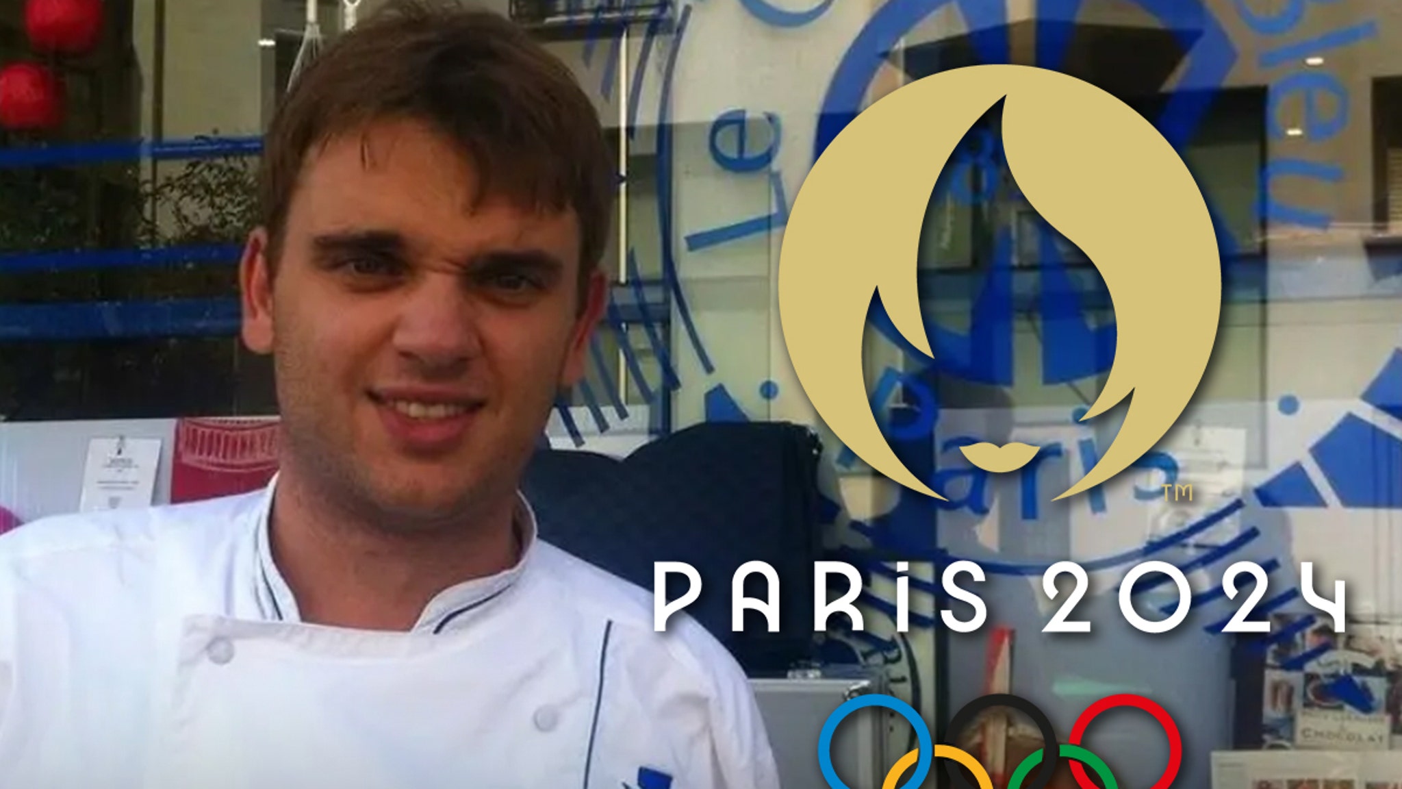
The 2024 Summer Olympics logo combines three main elements—the gold medal, the Olympic flame, and “Marianne”—into one cohesive design.
So who or what is Marianne, the mysterious female figure in the Olympics logo? If you’re from France, it’s likely no mystery, but for the rest of the world who may not be as aware — “Marianne is a familiar face in French culture that is omnipresent in day-to-day life, appearing on stamps and outside every town hall,” explains the IOC. She is a symbol of the French Republic and represents fraternity, generosity, humanism, and sharing, which are “the same values we find in sport,” they continue. “She reflects our desire to organize the Games for the people, in close collaboration with the people.”
Marianne’s face is represented in the logo by nothing more than a pair of gold lips. The rest of her image is created using the shape of a round gold medal (forming her head) and the white flames of the Olympic torch (which also create the shape of her face, framed by hair).
Below the main design is the PARIS 2024 wordmark, developed using the curves of the flames from the primary brand (see the curves in the “P,” “R,” and “4” for the clearest examples).
The logo will also be used for the 2024 Paralympic Games, with the Olympic rings simply swapped out for those of the Paralympics. This is the first time the same emblem has been used for both events.
The 2024 Summer Olympics logo was designed by Sylvain Boyer, a French graphic designer, who told The Creative Factor the inspiration behind using a female face on the logo.
“When we first designed the logo in 2018, Paris began seeing a greater movement for social equality for women,” Boyer said to the site. “Every week in 2018, there was a strike for a social cause, whether it was a women’s march or Fridays for the Future.”
“We wanted to do something different. We thought, What happens if we take a woman’s face and put it in the performance arena? And so the shock, the semantic shock, comes from that. Our country has an allegory, Marianne, who is the symbol of democracy and the Republic. In fact, we see a lot of women’s allegories all over the world — think of the Statue of Liberty, for instance. When we designed our logo, we jumped off of our country’s cultural context and historical legacy. “
Boyer also shared that the lips in the logo were red during most of his design process, only changing to gold after the IOC requested he do so.
“We first designed it with red lips, but the Olympic Committee said we had to change that,” he explained. “A lot of people only see the flames and they don’t see a woman when they first look at it, and that used to bother me, but today I like that. It’s like a game of perception. If you want to see only the flame, you see only the flame. If you want to see the woman, you see the woman. If you want to see a gold medal, you see a gold medal.”
If you’d like to learn more about the process, I encourage you to read the full interview at The Creative Factor.
The Paris 2024 Summer Olympics officially gets underway with the Opening Ceremonies held on Friday, July 26th (despite a few events getting a head start two days earlier). The Games will then run for two weeks before the Closing Ceremonies will be held on Sunday, August 11th.
If you like Olympics Logos, check out our Summer Olympics logo history page here, or you can look into the future and learn all about the Los Angeles 2028 Summer Olympics logo(s).