
Things are looking up for women’s professional soccer in Vancouver as the city’s Northern Super League franchise unveiled their name and crest this week.
The team launched their identity on their website and social media channels on Monday, August 26, with a corresponding event at D/6 Bar and Lounge at Parq Vancouver. They’ll henceforth be known as Vancouver Rise FC.
The name symbolizes more than just a team; it’s a beacon of empowerment and progress, inspiring the next generation to rise above and chase their dreams. Just as the mountain and sun overlook the city each day, bringing light and energy to the world, Vancouver Rise FC represents the dawning of a new era in soccer.
— @VancouverRiseFC on Twitter
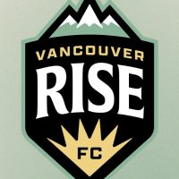
The team’s crest features a black shield with “RISE” written in bold white arched letters in the middle. Above that is “VANCOUVER” in gold, while below is a gold sunburst with “FC” written in black. Above the shield, three teal mountain peaks rise up, representing the three mountains that overlook the city: Cypress Mountain, Grouse Mountain and Mount Seymour. The whole crest has a teal outline.


The teal in the color scheme represent represents the “vibrant, natural beauty of British Columbia” while the gold represents “our beautiful summer sunsets, where the coast meets the mountains.” The black “symbolizes the depth of the Pacific Ocean and its underlying strength.”
“This is a landmark moment for professional sports in Canada,” said Stephanie Labbé, former Canadian women’s national team goalkeeper and Rise FC sporting director. “Vancouver has always had incredible support for the women’s game, and now the city finally has a team to call their own. After months of consulting with fans and stakeholders, we are proud to announce the identity of this club that we are building together. Vancouver Rise FC will be a team that will inspire generations to come, and we can’t wait to welcome everyone to be a part of it.”
The club also released a wordmark with “RISE FC” in large arched letters with “VANCOUVER” over top. They also unveiled a club slogan, “STRONGER BY NATURE.”
“Stronger by Nature” reflects the inherent qualities that define Vancouver Rise FC — a team built on values of unity and the relentless pursuit of excellence. Just as the mountains stand strong and the sun never fails to rise, the team draws strength from the community and awe-inspring nature that Vancouver is known for.
— @VancouverRiseFC on Twitter
The identity package was designed in partnership with Victory Creative Group.
The Northern Super League is scheduled to begin play in April 2025 with six teams across Canada. The Vancouver franchise is owned by the same group as Major League Soccer’s Vancouver Whitecaps.
Rise FC is the fifth of the six teams to unveil an identity; only the Montréal franchise has yet to do so. Other identities unveiled include:

