It’s official. Toronto’s new WNBA expansion franchise announced this morning that it will indeed be called the Toronto Tempo, debuting for its inaugural season in the summer of 2026.
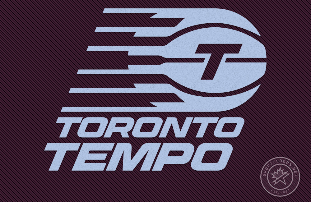
The Tempo also unveiled its logo and colour scheme, confirming our report from yesterday.
“Tempo is pace. It’s speed. It’s a heartbeat. And it’s what you feel when you step into the streets of this city, and in the energy of the people who call Canada home,” said Teresa Resch, President of the Toronto Tempo in the press release. “As Canada’s WNBA team, I know the Tempo will set our own pace, move at a championship cadence, and inspire people across this country.”
The name Tempo was selected following a summer name-the-team contest. More than 10,000 submissions were sent in, and the team settled on a name designed to resonate in English and French to appeal to the fans who live all across Toronto, Canada.
“Tempo reflects what fans can expect from this team – including, of course, the in-game experience at the arena,” Resch continued. “The sounds of the court. The beat of the music. The passion of the fans around you and the intensity of the players on the floor. Capturing all that energy, excitement, and feeling was crucial as we chose the name for Canada’s WNBA team.”


The team’s logo features a white “T” on a light blue basketball with six speed lines trailing to the left, symbolizing movement and progress. The six lines don’t represent Toronto’s nickname, “The Six.” Instead, they represent “the five players on the court and the sixth player in the game: the fans.” So, not only does it look like the Indiana Pacers logo, but it uses the same logo logic as the Portland Trail Blazers. The team also explained that the logo’s sharp angles and rounded curves represent the dynamic nature of the game and the team.
Their “Global Logo,” which we treat as a team’s primary brand element, features this white T on a basketball design with the team name below. Additional logos involve pieces of this overall design broken out on their own: just the basketball and the T is the “Primary Icon,” a logo featuring just the T with speed lines all by itself is the “Secondary Logo,” and the team name, of course, is their “Wordmark Logo.”
According to Resch, the Toronto Tempo’s light blue and maroon colour scheme is “a modern take on a very familiar Canadian colour palette.” The team didn’t elaborate.
It is important to note that the logo we posted yesterday in light blue is apparently the version the club prefers to be used only when placed on a dark background. A version of that same logo exclusively in maroon is designated as the one to use on a white or light background, at least from what I’ve been shown. As of yet, I haven’t found a version of the logo that incorporates the blue and maroon into one cohesive design (beyond simply existing as the background colour), but I’d be surprised if one isn’t out there.


Throughout the process, the Tempo Instagram account shared some of the names they received and why they were rejected, a new idea I hope other future nameless clubs carry on. Unfortunately, the club scrubbed away all of their pre-name Instagram posts this morning (and I didn’t save ’em when I saw them because, like, why would they ever disappear?), so we can’t share them with you anymore… The only one I recall now is “Toronto 6ixers, which they said was rejected due to the similarity to Philadelphia’s NBA club.
Toronto Tempo is owned and operated by Kilmer Sports Ventures. The company was awarded the franchise in May 2024 as part of the WNBA’s first expansion outside the United States. The team will join the league as its 14th franchise and play at the Coca-Cola Coliseum, home to the AHL’s Toronto Marlies and the PWHL’s Toronto Sceptres.
The Tempo says a full line of merchandise is unavailable at this time (I’ll assume because the name wasn’t meant to be revealed so early) but will be available soon.


